Creating the UX of an Apple award winning EdTech dashboard
Rally Reader
My Role
I was an intern at Rally Reader during my off-term for my Junior fall at Dartmouth. For the first 1.5-2 months of the internship I was the sole UX designer on the project conducting user research and identifying current pain points in the app. Rally hired another UX designer and we worked together to improve the UX of the dashboard of the app.
Skills
User research
Competitive analysis
Rapid prototyping
Tools
Figma
Miro
UserTesting.com
Team
2 Designers
CEO
2 Education specialists
Time
Context
CONTEXT
Rally Reader is helping children read on their own at home
Rally Reader is an EdTech B2C start-up that uses an AI powered reading assistant to help struggling early readers to read on their own. The app houses a tutoring service run by educational professionals and an extensive library of books for children to read and learn from.
Problem
But, they haven’t focused on user experience
Previously, Rally used a separate design agency to make UI designs. I was the first UX Designer at Rally Reader as an intern at the start up. My job was to do user research to better understand the target audience of the app: young readers who are struggling to read and their parents and modify the UX of the app based on what I found.
My final deliverable was grayscale wireframes. Some constraints of the project included limited user research resources: we only had a 5 interview free trial of UserTesting.com to talk to potential customers.
Opportunity
HMW
Better cater the features of Rally Reader to the needs of early readers?
Building struggling readers’s confidence through gamification
Solution
We redesigned the dashboard to better incentivize young readers to read everyday
Design Process
research
Talking to parents of young readers
I conducted 5 user interviews through UserTesting.com with parents of young readers at home to figure out how Rally Reader might fit into their reading and learning ecosystems. I wanted to learn 3 main things:
Reading at home
How is reading at home approached? How do their kids feel about reading?
Other learning platforms
What online learning platforms are kids currently using? Why?
Thoughts on Rally Reader
How does Rally compare? Is this something they would use at home?
Reading can be fun activity or a pain point
The way children feel about reading greatly influences how it is approached at home:
Positive feelings
“With my kids, mastery of reading led to enjoyment”
“We have routines for reading typically at bedtime that he always is excited for.”
“The only thing that’s a struggle with reading is finding books they love.”
Negative feelings
“When she’s reading and comes across words she doesn’t know she gets very frustrated and wants to stop.”
“She prefers being read to and following along in apps.”
“He would rather do anything but read.”
Online learning platforms are commonly used by families
From talking with parents, I learned what features were most impactful in getting children interested in a learning app:

80%
of families use online learning platforms at home
75%
of kids in the families are highly driven by in app quizzes
50%
of families have kids with a streak on another platform
Parents’ thoughts on Rally Reader
I also took time in the last 3 interviews to show them the key features of Rally Reader, focusing on the dashboard:
66%
Liked the dashboard
1 in 3
Downloaded the app
What parent’s had to say:
“I like the level of detail, I could really see where they might be struggling.”
“The biggest sell to me was the dashboard features, my kids would love streaks.”
“I liked the dashboard for myself, but it doesn’t look designed for a kid like my 5 year old.”
Define
What separates struggling and successful early readers?
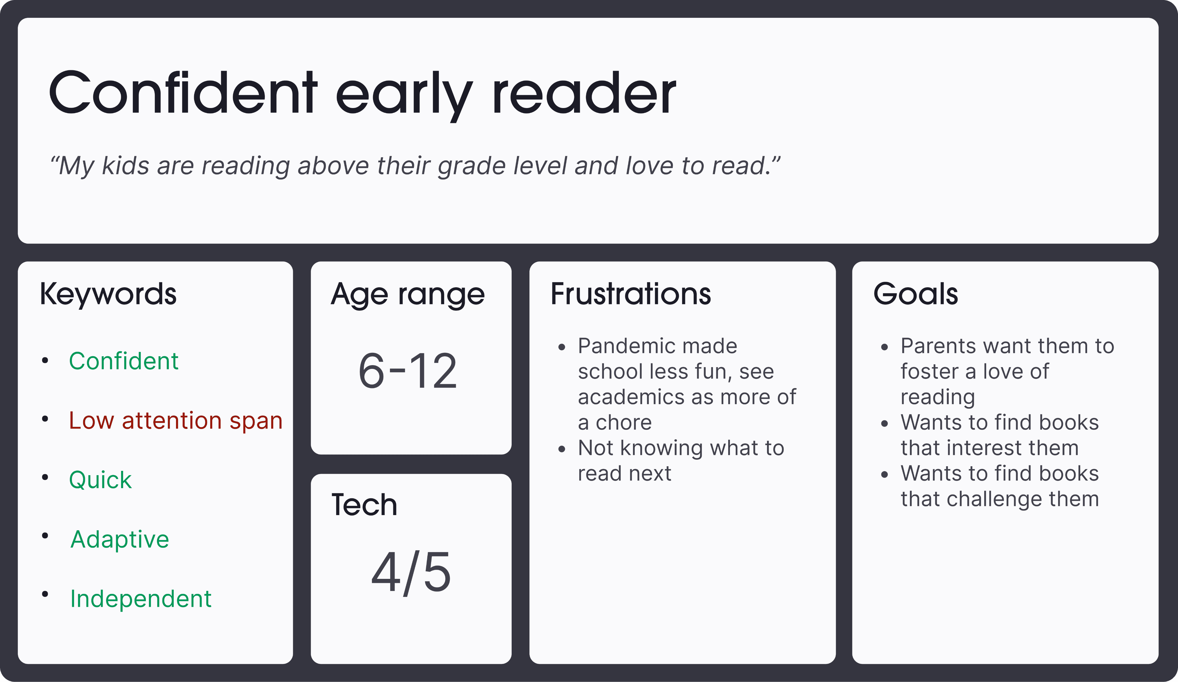
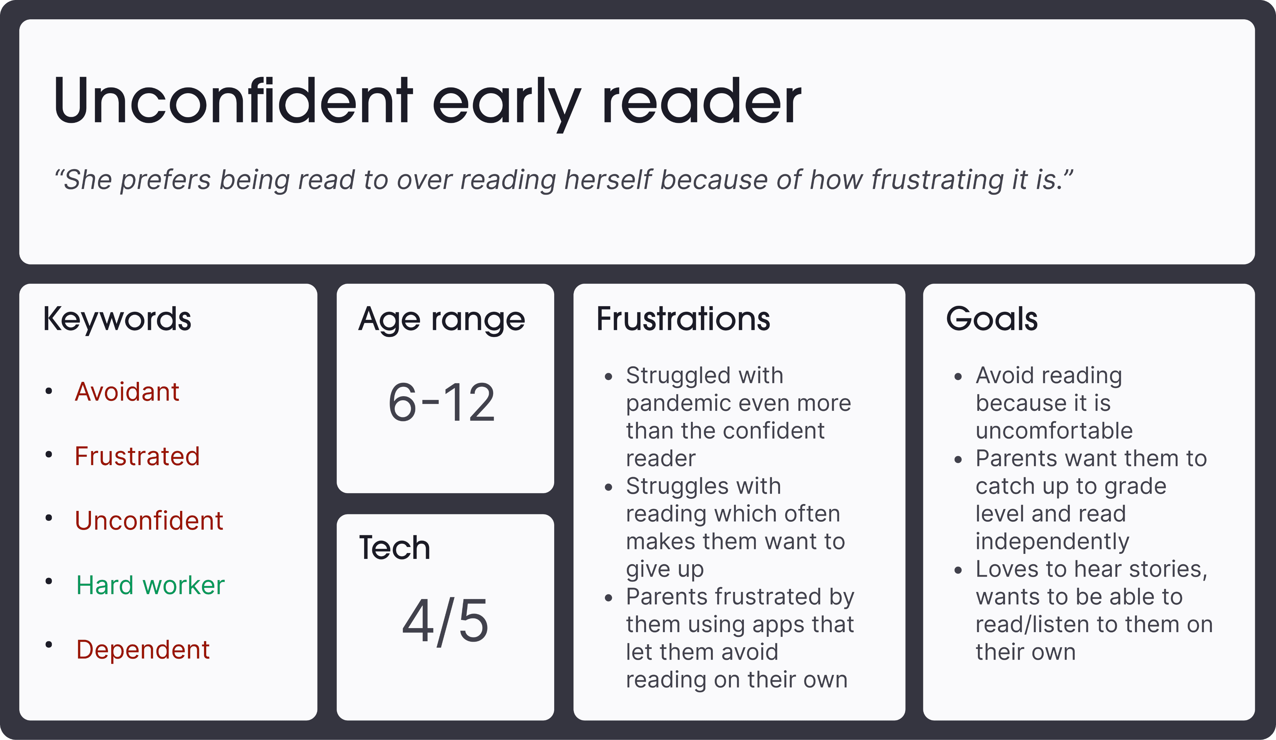
Based on our research, I saw that a child’s confidence greatly influences how they approach reading, giving us two kinds of early readers:
Confident early reader
Strong and avid reader
Likes challenges
Less stressful home environment around reading
Unconfident early reader
Struggles learning how to read
Avoids reading
At risk of getting behind
Problem statement
Since Rally is focused on helping struggling readers, I narrowed in on the unconfident early reader:
The unconfident, struggling reader needs a way to build their reading confidence in order start to enjoying and improving their reading.
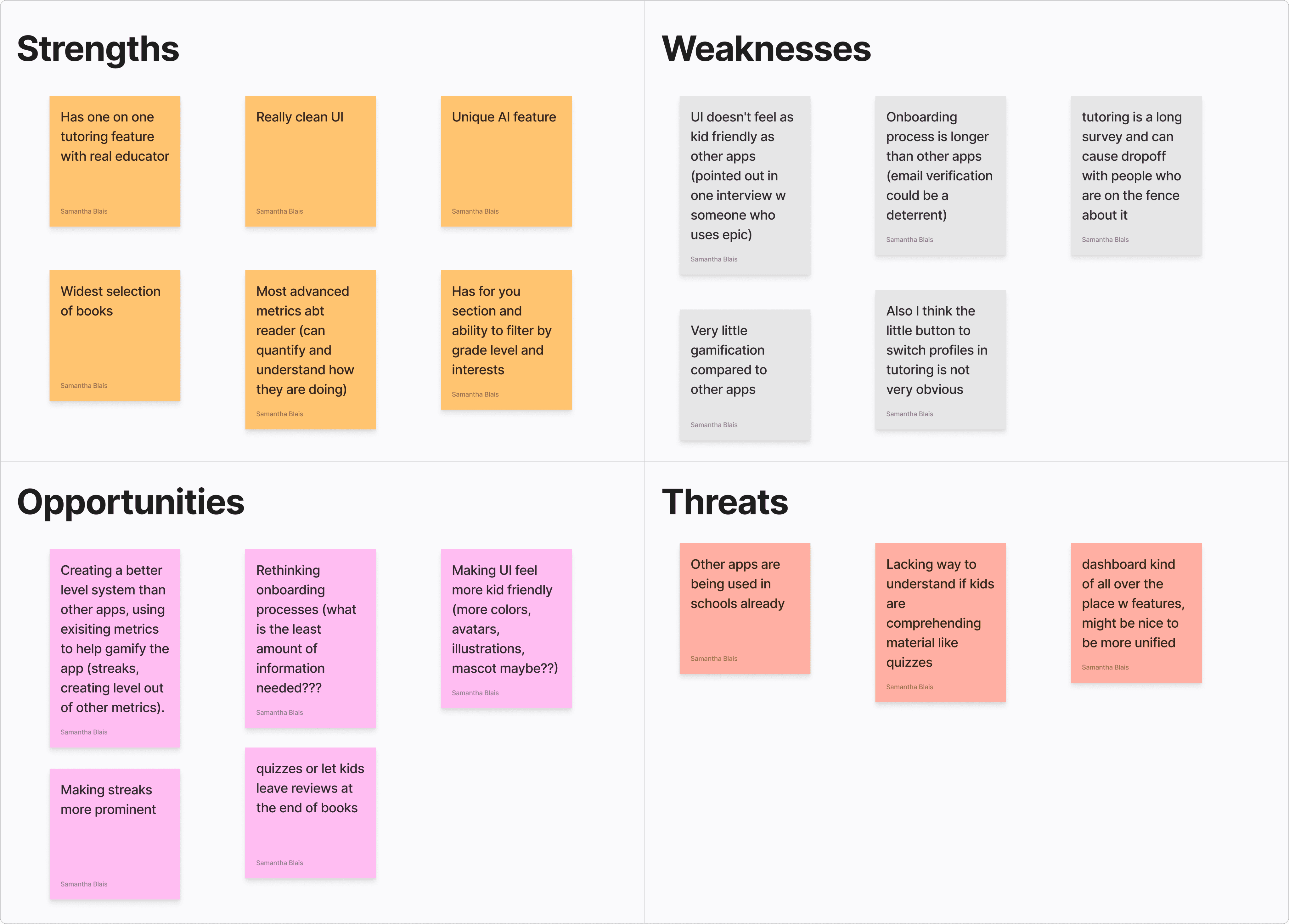
Rally Reader SWOT
Looking at the SWOT below, Rally has lots of strengths in what they currently offer, but has opportunities to grow through making a more cohesive gamification experience and designing more for kids.
HMW
Make Rally a comfortable and motivating space for struggling early readers to build confidence?
Based on the needs of the unconfident reader and where Rally could grow to compete with similar apps, the CEO wanted me and their second UX hire (Megan Ruggio) to focus on redesigning the dashboard.
Ideate
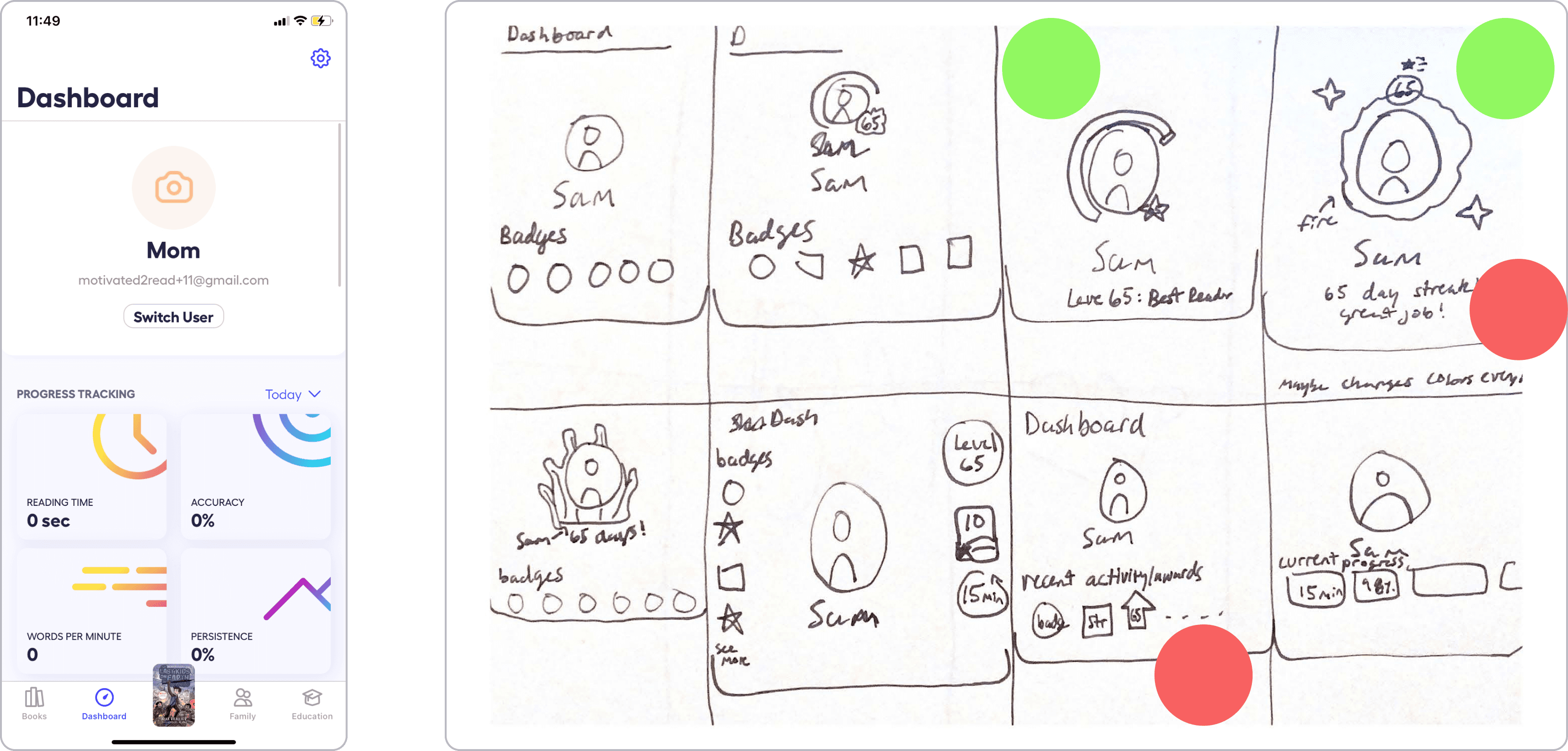
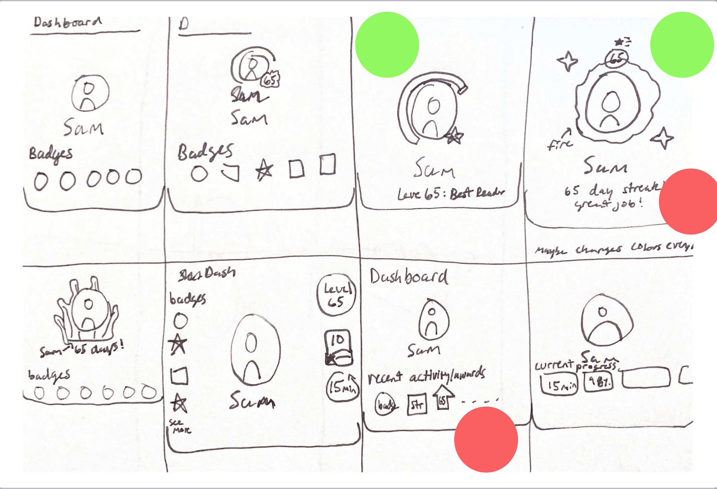
Starting from the top: reimagining the dashboard
The other designer and I started by thinking about how we could make the header of the dashboard more engaging. Currently it just has the name, a picture, and an email on it.
We really like encasing the profile picture in something like a streak, a level system, and showing recent awards/ achievements
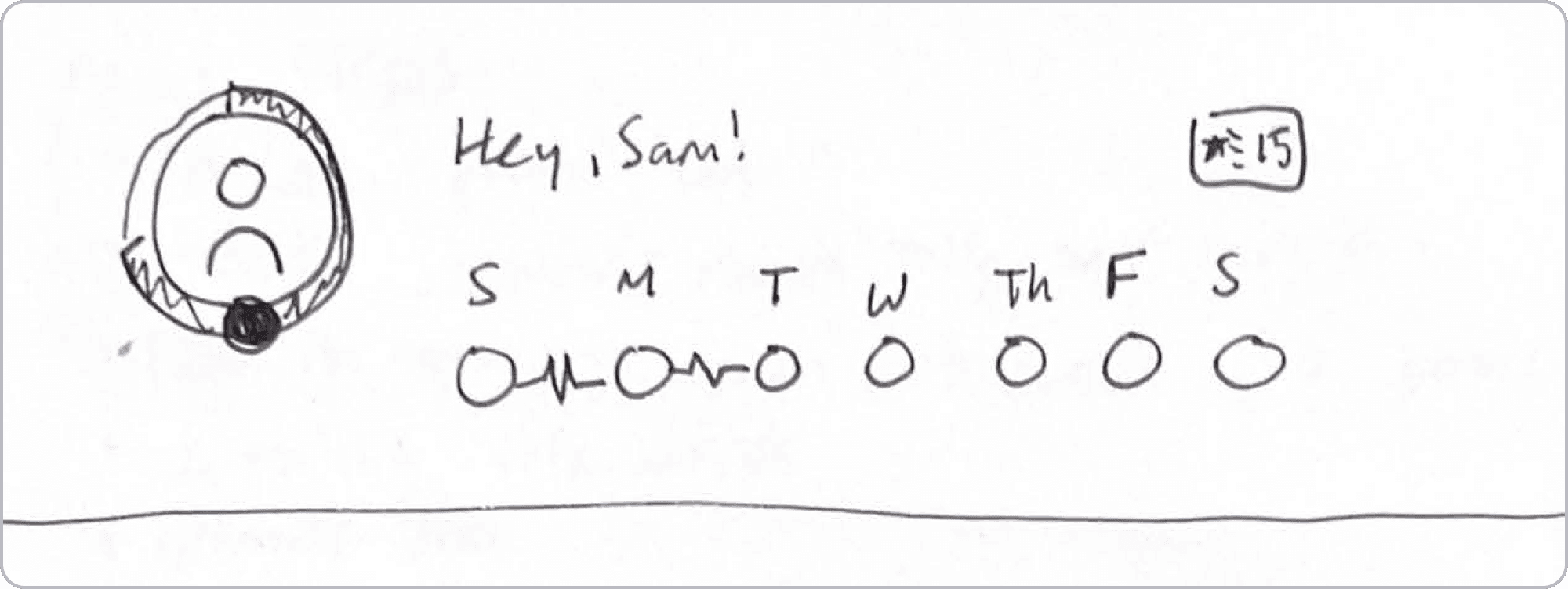
Incorporating streaks and time spent reading
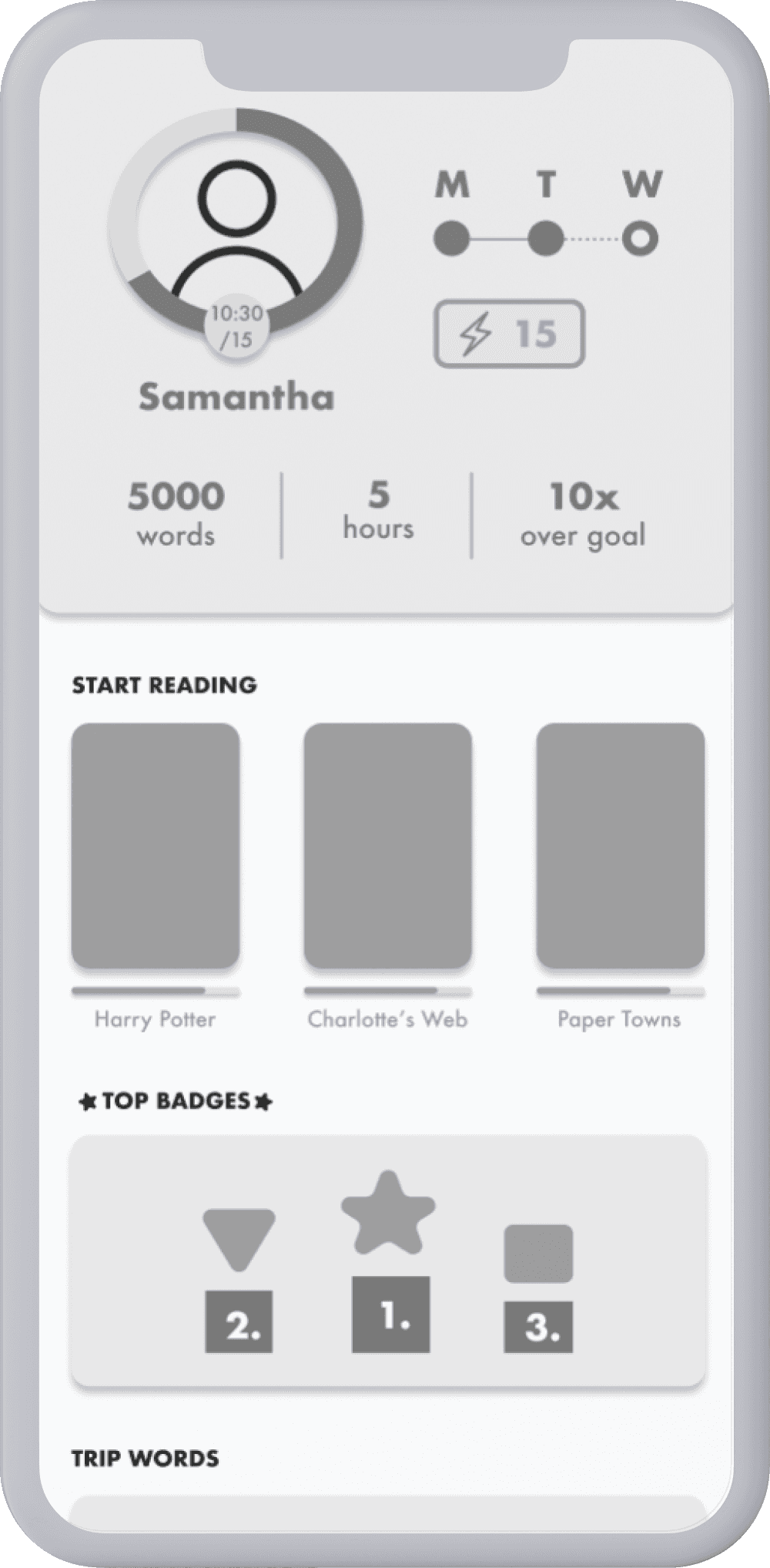
We decided on having the time spent reading out of your daily goal wrapped around the profile picture and having the streak feature live in the header. Students are greeted with what they need to do: read for x amount of time, and a motivating feature: if you read for that long, you get to keep your streak.
We felt like set up was perfect for our unconfident reader because they don’t need to read at a certain level or get a perfect score to get an achievement: they just need to show up for themselves!
Prototype
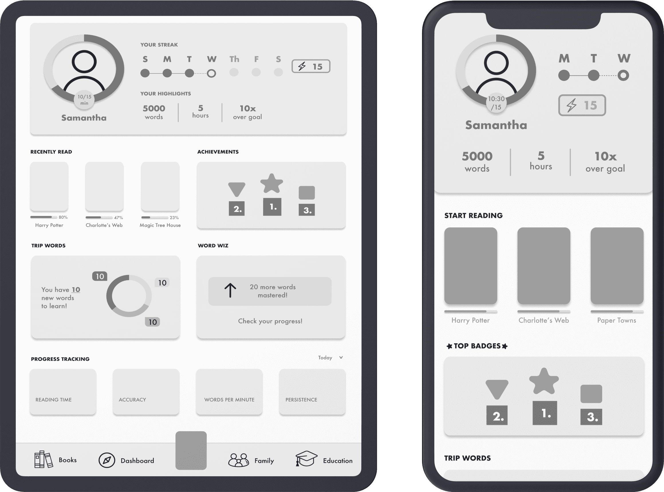
Grayscale iterations on iPad layout
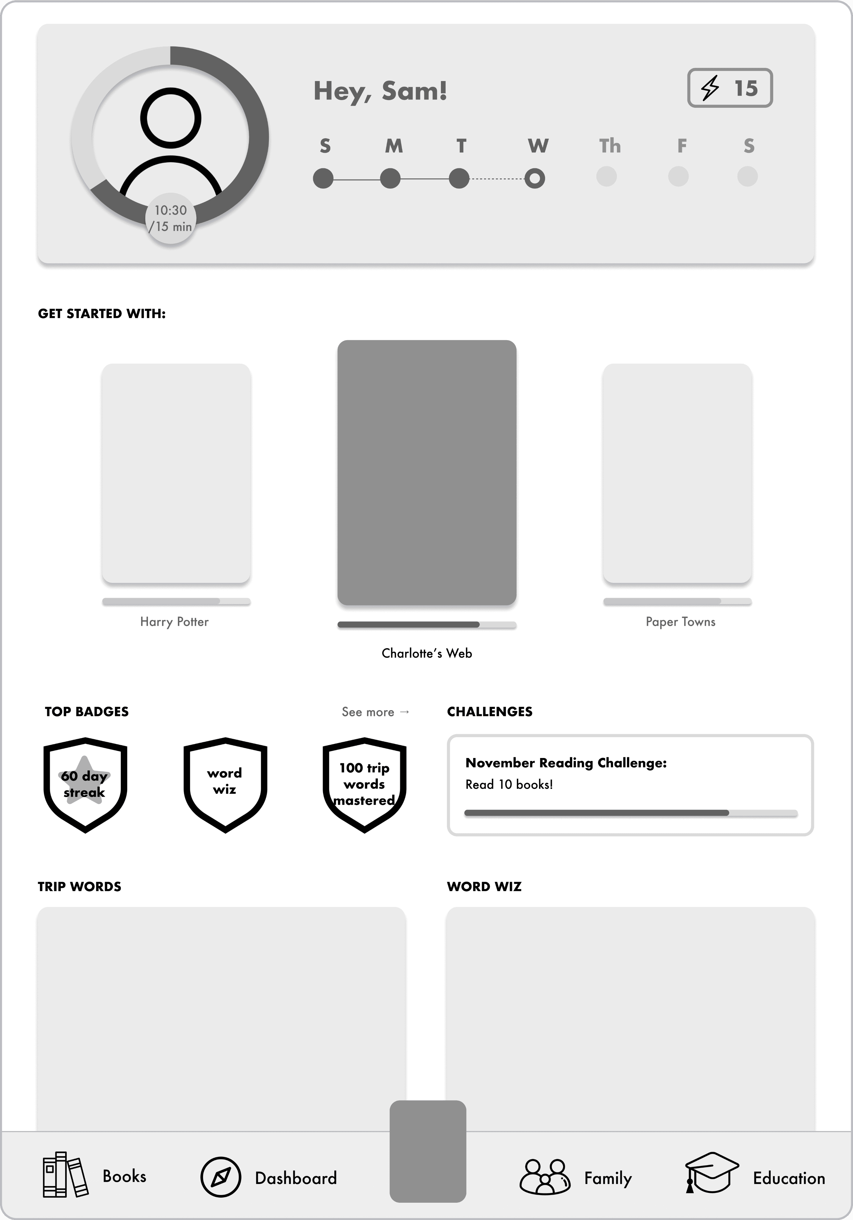
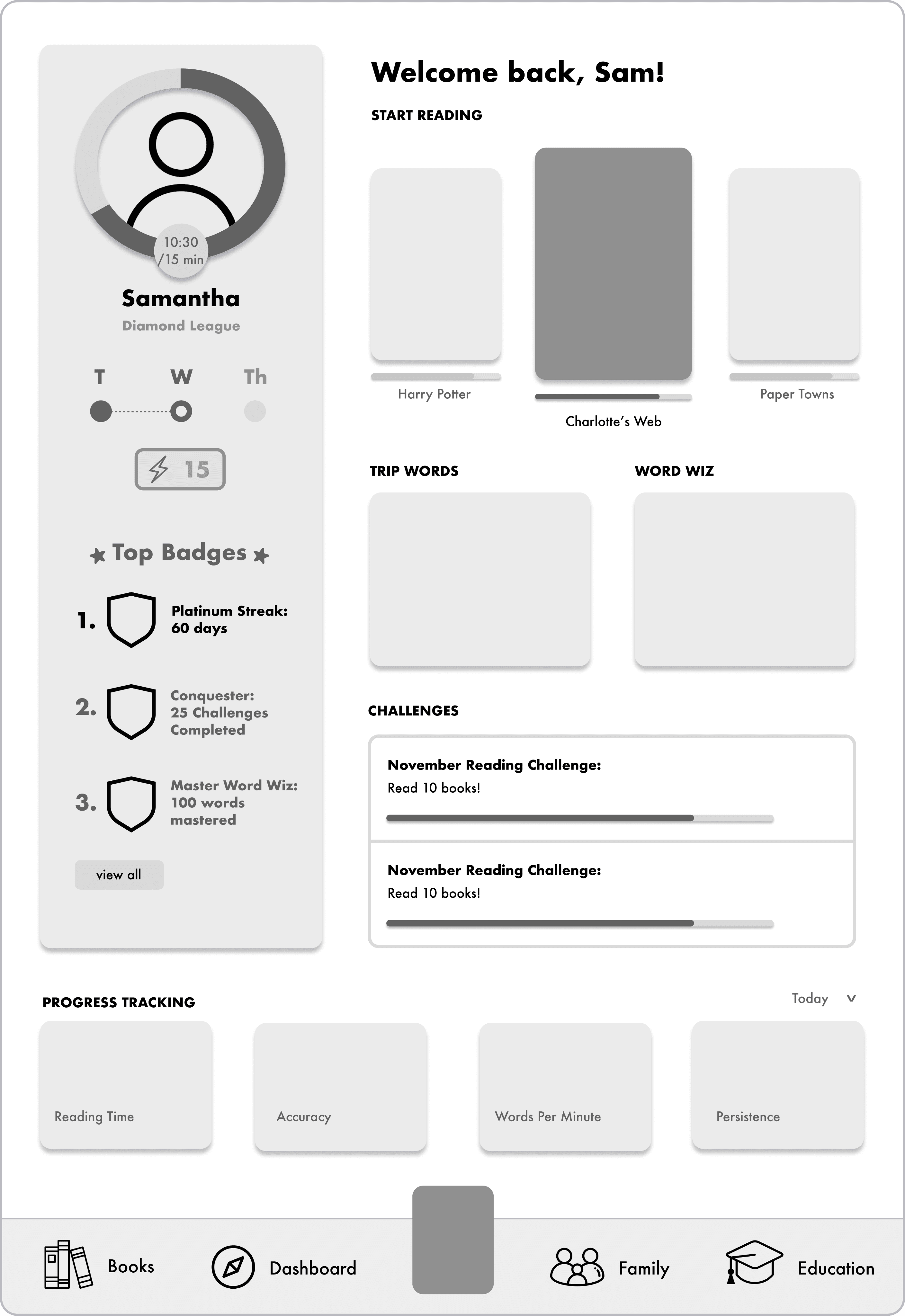
Once we moved to grayscales, I started playing around to see how we might inspire kids to keep reading from the dashboard. I came up with 2 new potential designs
1
Horizontal Header
This design incorporated the new header features while also introducing a reading suggesting feature to help kids get started with their reading, a struggle from interviews.
2
Vertical Header
I made this design to make the header on the iPad a similar width to the iPhone. I added the top badges into the header to make the header focused on celebrating progress
TEST
CEO and education specialist feedback
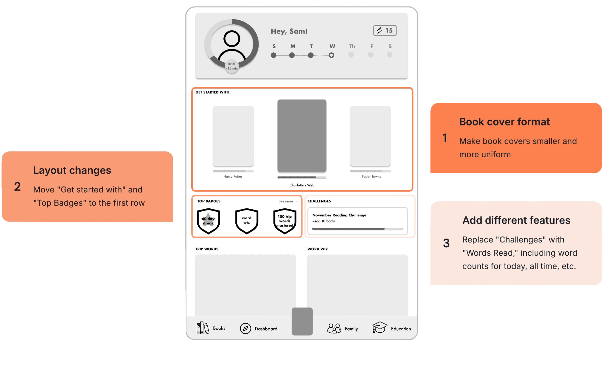
My partner and I showed those two screens and several similar iterations to the CEO and 2 education specialists. They were happy with the designs we had to show and really liked design #1 with 4 out of 5 people in our group preferring that layout over #2s, but for our next iteration they had a couple of new asks:
Prototype
Final grayscale iterations
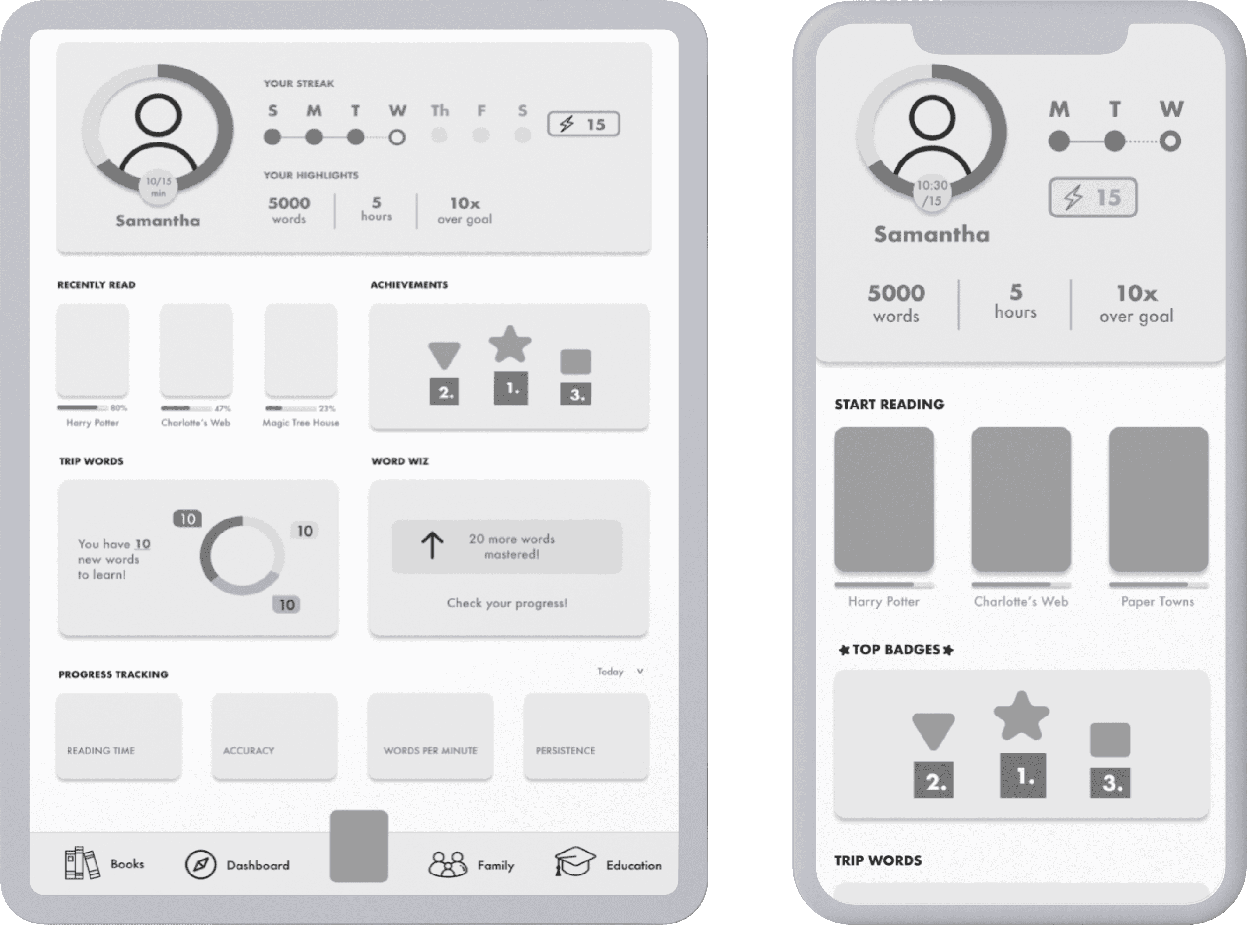
Our final iteration included these key design changes:
Streaks and daily goal
Based on interview insights, we prioritized streaks and daily goals by placing them in the header.
Your highlights
To quantify reading progress without emphasizing reading quality, we added new trackers
Recently read and layout
We redesigned the dashboard to prioritize kid-friendly reading features adult-ish metrics.
TEST
One of the biggest constraints of this project was access to people in our user group and time at my internship. We only had a 5-test free trial of UserTesting.com for user research, and since I did not know anyone in fitting into our user groups, was running out of time at my internship, and busy with internship tasks outside of UX design, I was not there for user testing on the project. If I were to do testing on this product, I would use:
Usability Metrics
Jusification
A/B Testing
Compare user retention: does this new version make kids use the app more?
This would be valuable because if kids are spending significantly more time on this version of the app, we could assume they are reading more on it.
Net Promoter Scores
Is this new version more likely to get Rally promoted more?
If this version has a higher NPS, we could assume that Rally is satisfying more customers and may be getting recommended more to friends and family.
Qualitative feedback
What do kids and parents have to say about these changes to the dashboard
Qualitative feedback from parents and kids would be most valuable as we figure out what is successful and what isn’t in our new dashboard and better optimize it for them.
Shipped product & impact
Since the dashboard update, Rally Reader was accepted into Apple’s Educational Partners Program at the Global level, with the dashboard being cited as a stand-out feature!
You can find Rally Reader on the Apple store here!
REFLECTIONS AND NEXT STEPS
Reflections
I loved this project because of how passionate I felt about the mission of the product. I would love to continue to work in EdTech in the future, I think it is a really fun and interesting way to think about what I’ve learned about learning through my neuroscience major (and my favorite class at Dartmouth, “The Impact of Poverty on Education.”) while applying my design toolkit. In addition to the project itself, I also loved working at a startup!
Adaptability and versatility
Starting as the sole designer, I learned to be adaptable and versatile, handling various tasks beyond UX design like creating tutorial videos and consolidating style guides. This experience highlighted the need to manage multiple responsibilities efficiently in a startup environment.
Creative problem-solving with limited user access
Facing limited user access, with only five usertesting.com interviews, I had make sure I got the most out of them and, additionally, heavily relied on competitive analysis and creative problem-solving to design the new dashboard. This taught me to maximize available feedback and use alternative methods to gather insights, resulting in an effective, user-centered design.
Collaboration and communication with cross-functional teams
Collaborating with the CEO, education specialists, and another designer emphasized the importance of teamwork and communication. I learned to present designs, gather feedback, and iterate based on various perspectives, ensuring the final product met user and business needs while building strong working relationships.
Next steps for Rally could include...
Usability testing
If I were to continue this project, my next step would be to conduct usability testing on the dashboard as discussed in the test section!
Identifying and addressing other user pain points
Future work could include looking at other sections of the app, specifically the onboarding process since that has the biggest drop off, to see how they could be improved. There are also some niche features in the app like Word Wiz. It might be nice to test people's understanding of it and to see if there should be a tutorial explaining it.
Resonating with kids more
I think it would be fun to personify the AI as a cute robot that helps you read. I discussed this with the CEO and they struggled with older kids finding mascots too childish, but I wonder if there would be a way to do it tastefully for them!
