mGAME
Improving goal tracking in a post-operation recovery platform
My Role
I worked on this project in DALI as the design mentor for its second and final terms. As a design mentor, I led a team of 5 designers and assisted in project scoping with the PM, designers, and developers.
Skills
Usability Testing
Rapid prototyping
Des/dev collaboration
Team
3 Designers
3 Developers
1 PM
Tools
Figma
UserTesting.com
Time
Jan - June 2023
Background
Orthopedic surgery recovery currently has
Our clients for this project were an orthopedic surgeon and physical therapist from Dartmouth-Hitchcock Medical Center. They came to DALI wanting help with their current goal tracking digital platform for patients after orthopedic surgery.
Opportunity
HMW
Help bring patients and providers together while tracking patient progress towards a personal recovery goal
Solution
Goal Setting Interface

Solution
Goal Tracking Interface
Design sprint 1
Reworking the Goal Setting Interface
I created a user testing plan to identify any pain points in the following areas of the goal setting prototype from the term before:
1. User flow
Quality of goals set by patients
Design system
User flow Issues

(Tested Prototype)
Prototype tested
Patients are open to goal-setting and recovery discussions with their providers
User flow Solution
3. Providers and patients need to focus on the right metrics
Research shows activity-focused recovery leads to better outcomes than pain-focused.
Key design changes
1. Patients value continuity and consistency
Patients struggle with inconsistent recovery experiences across providers and stages.
2. Patients want to have more conversations with their providers
Patients are open to goal-setting and recovery discussions with their providers
3. Providers and patients need to focus on the right metrics
Research shows activity-focused recovery leads to better outcomes than pain-focused.
Research
How should we track goals?
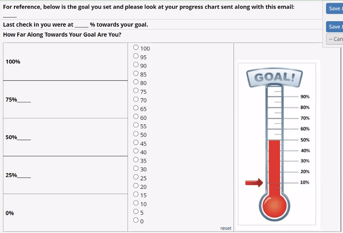
Our client’s original goal tracking interface relied on patients to report how they were doing in terms of percentages shown in the picture below:
Pain points with percentages
The current mechanism for goal tracking has patients report their progress by saying they are x% closer to or further from their goal each week.
Patients, however, found this hard to conceptualize
How do other apps track goals?
We conducted industry research to see what other goal tracking platforms use. Of the 6 apps we reviewed, we found that they commonly:
Log specific events
4/6 had users log specific events rather than looking back holistically at progress
Use scales to report feelings
3/6 utilized scales with preset emotions to let users log how they felt they were doing
Visualize growth
2/6 of the had a visual aspect beyond using statistics to show growth like growing plants
Key competitive analysis findings
Other apps don’t ask users to report what percent closer they felt to their goal, instead they rely on other easy-to-report measures to track this.
Since the percentages were a pain point original design, I decided to approach progress tracking without percentages like these other apps.
Define
Patients need an intuitive way to track their progress in order to accurately depict how far along they are in the recovery process
HMW #1
Make progress tracking more intuitive to the patient?
HMW #2
Motivate our users each week during recovery?
Ideate
Branching out from percentages
The other designers and I started brainstorming different ways to track progress after collecting inspiration and hearing pain points with the original platform:
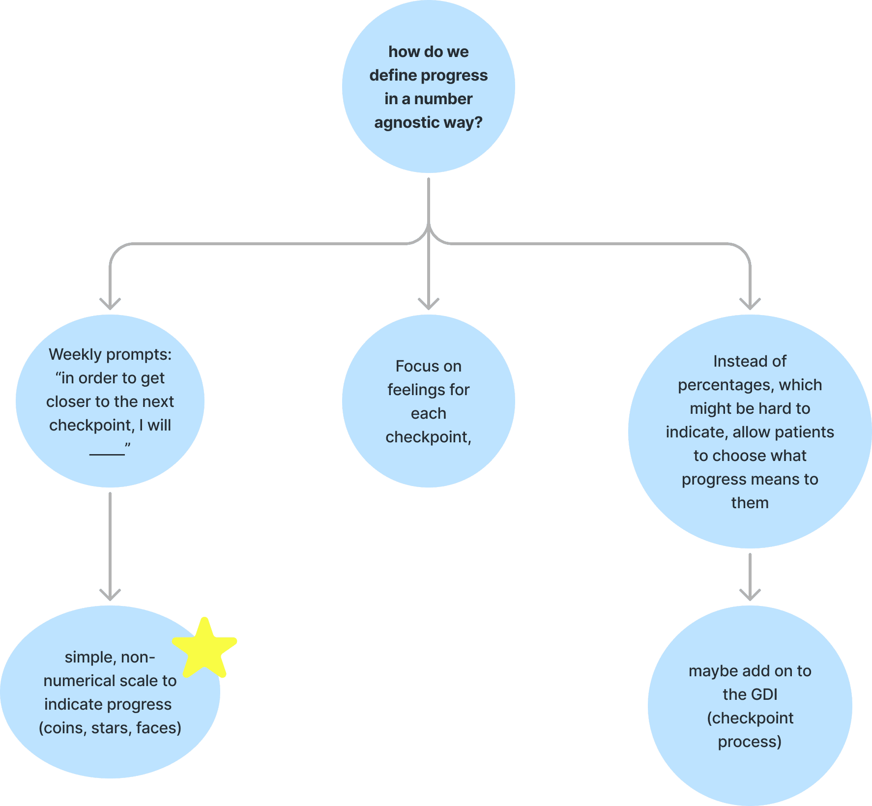
Incorporating Likert scales to simplify goal tracking
Inspired by other apps and medical questionnaires, we liked using a Likert scale for patients to measure progress, as it's easier for patients to assess than raw percentages.
Likert-Model

Developer pushback against the Likert model
When we brought this up in a team meeting, the developers were unsure about implementation while showing progress, since we need to numerically track the goal. After long brainstorming sessions, we came up with a happy-medium option:
Happy-Medium Model
In this version, patients are able to select a specific percentage from the percentage range after deciding on the Likert option that best represents where they are.

TEST
What do potential patients think is most intuitive?
The designers and I shared these ideas with 5 potential patients to receive feedback on what they would prefer for tracking goal progress. Out of the 5, 4 preferred the Likert model because it felt simpler than also including percentages.
Ideate/Prototype
Brainstorming with developers
After reporting our feedback about the preference towards the Likert scale, we brainstormed with the developers on how we could make this work.
Design decision: Compromising on the Likert Model
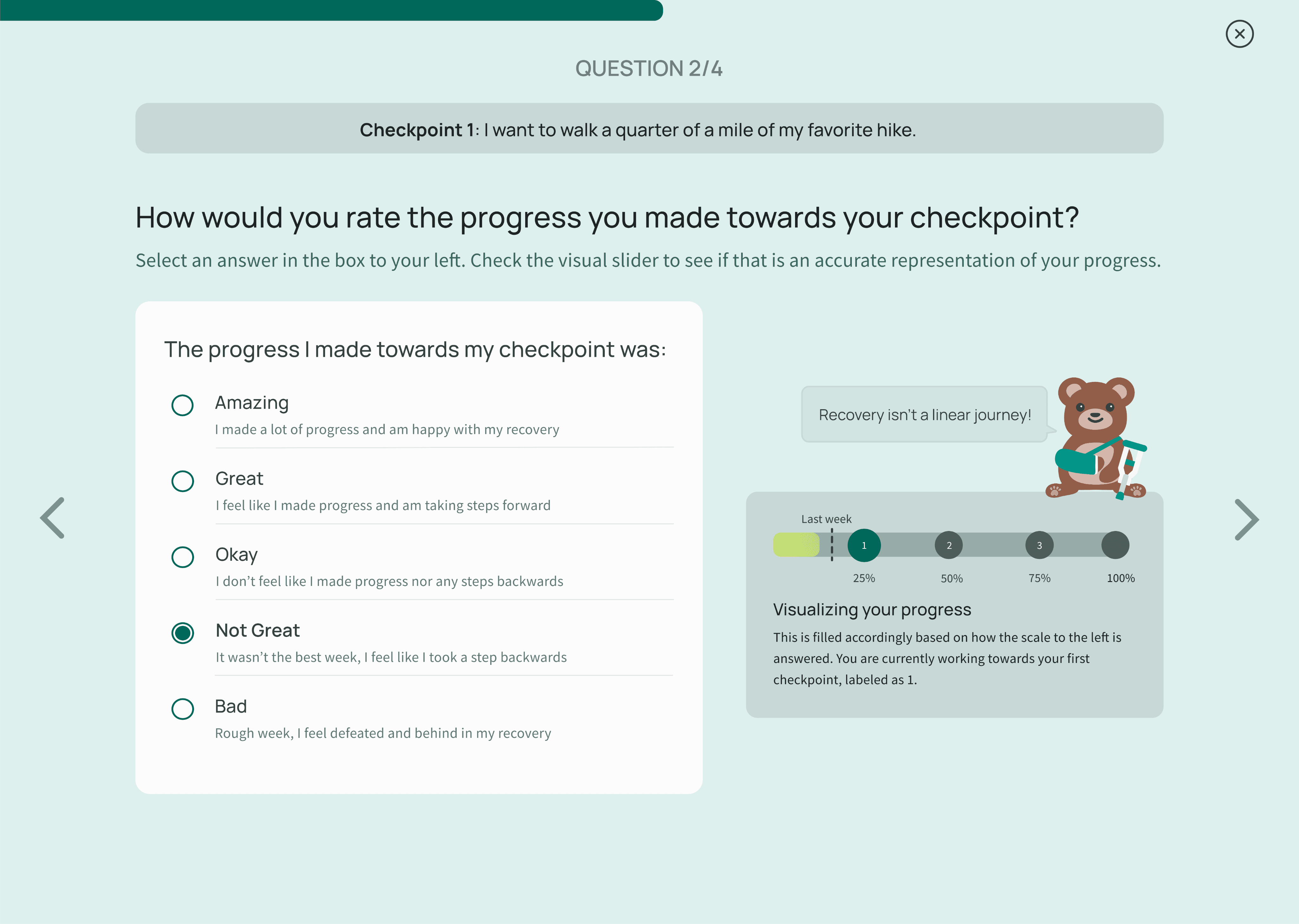
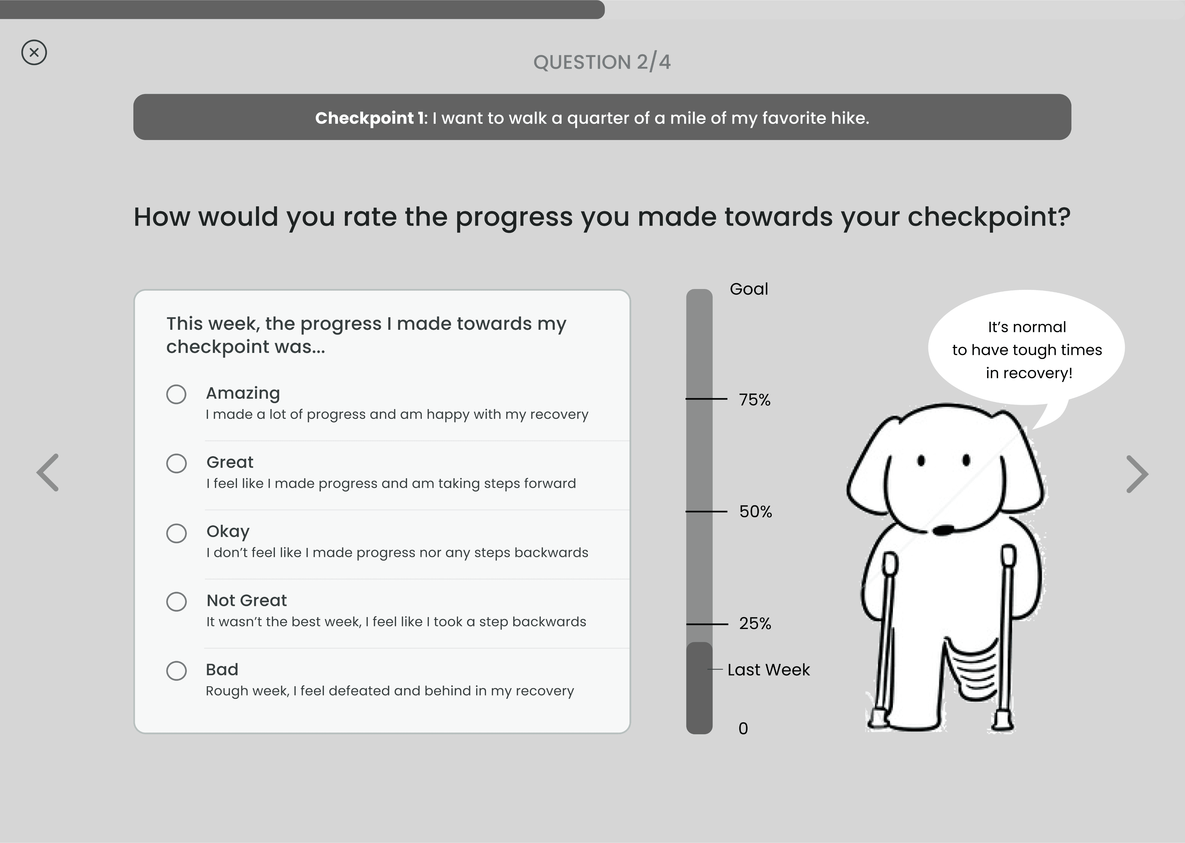
We ultimately decided on assigning hidden values to each likert option which numerically moves them towards their goal. To clue patients in on how close they are, we also included a moving scale on the page so patients could visualize what each progress option looked like, alongside a motivating quote from out filler mascot!
Prototype
Hi-Fi prototype
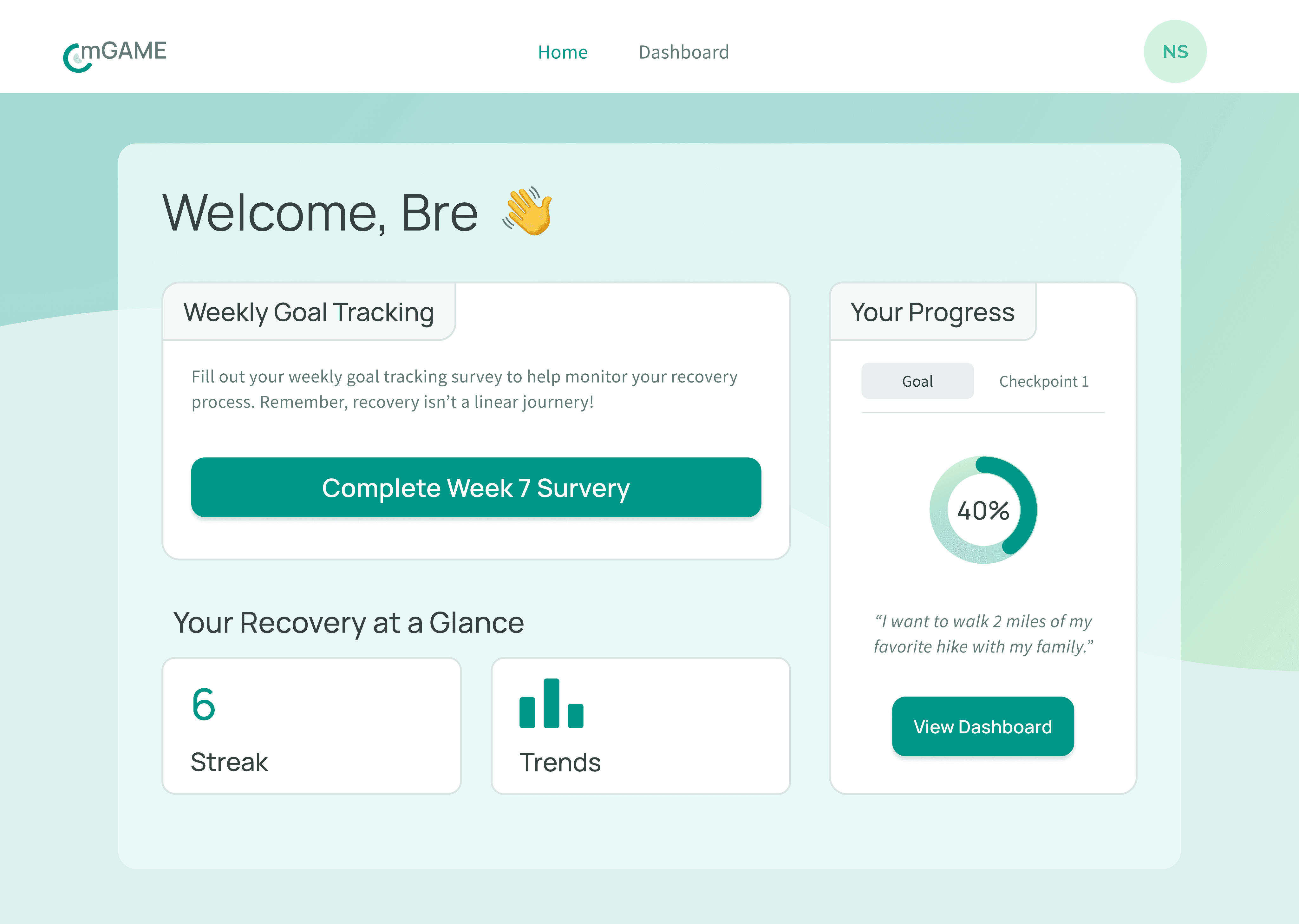
Start at Home
Our dashboard provides a snapshot of current progress in recovery and allows users to quickly jump into their weekly goal tracking survey when it’s ready.
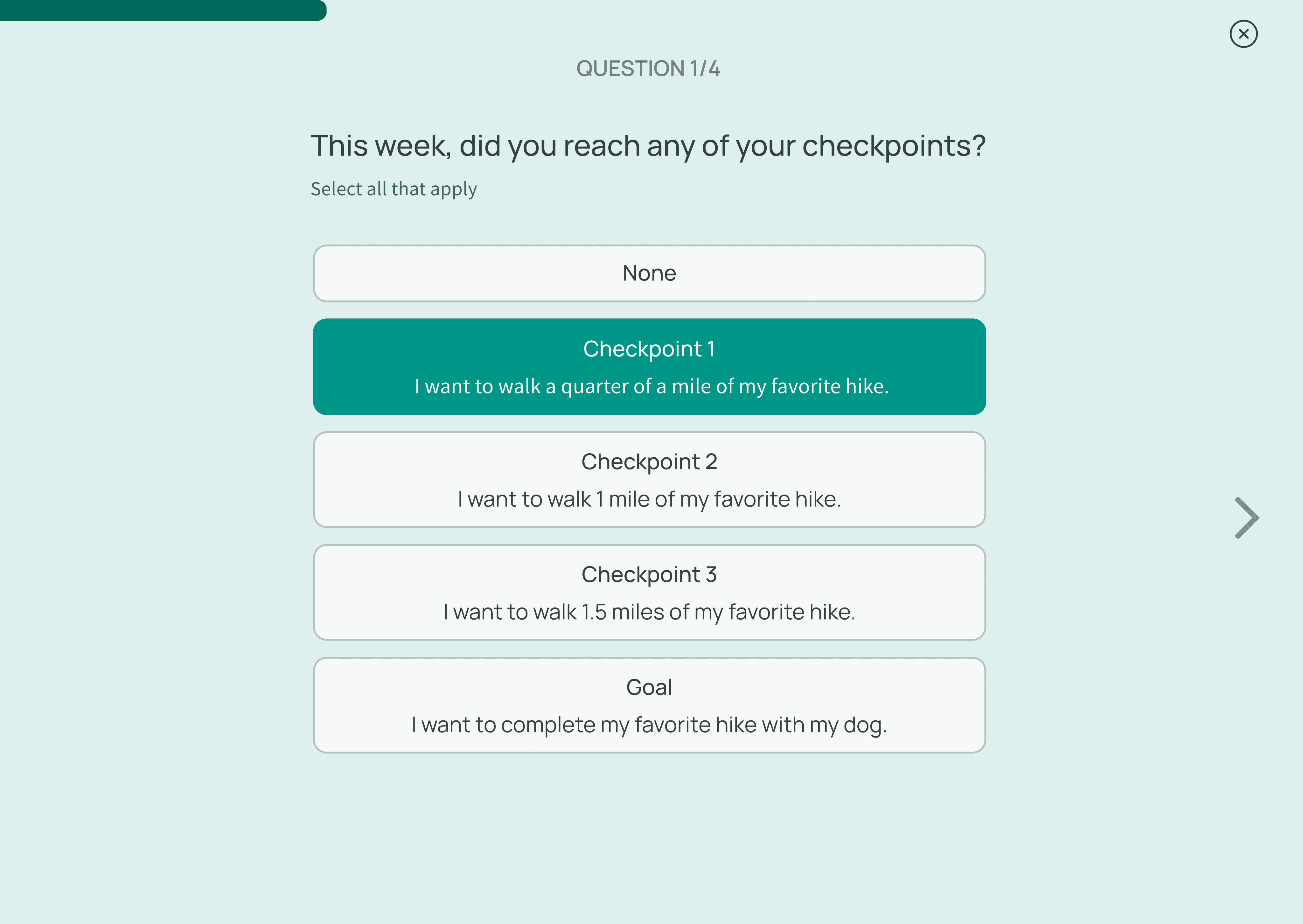
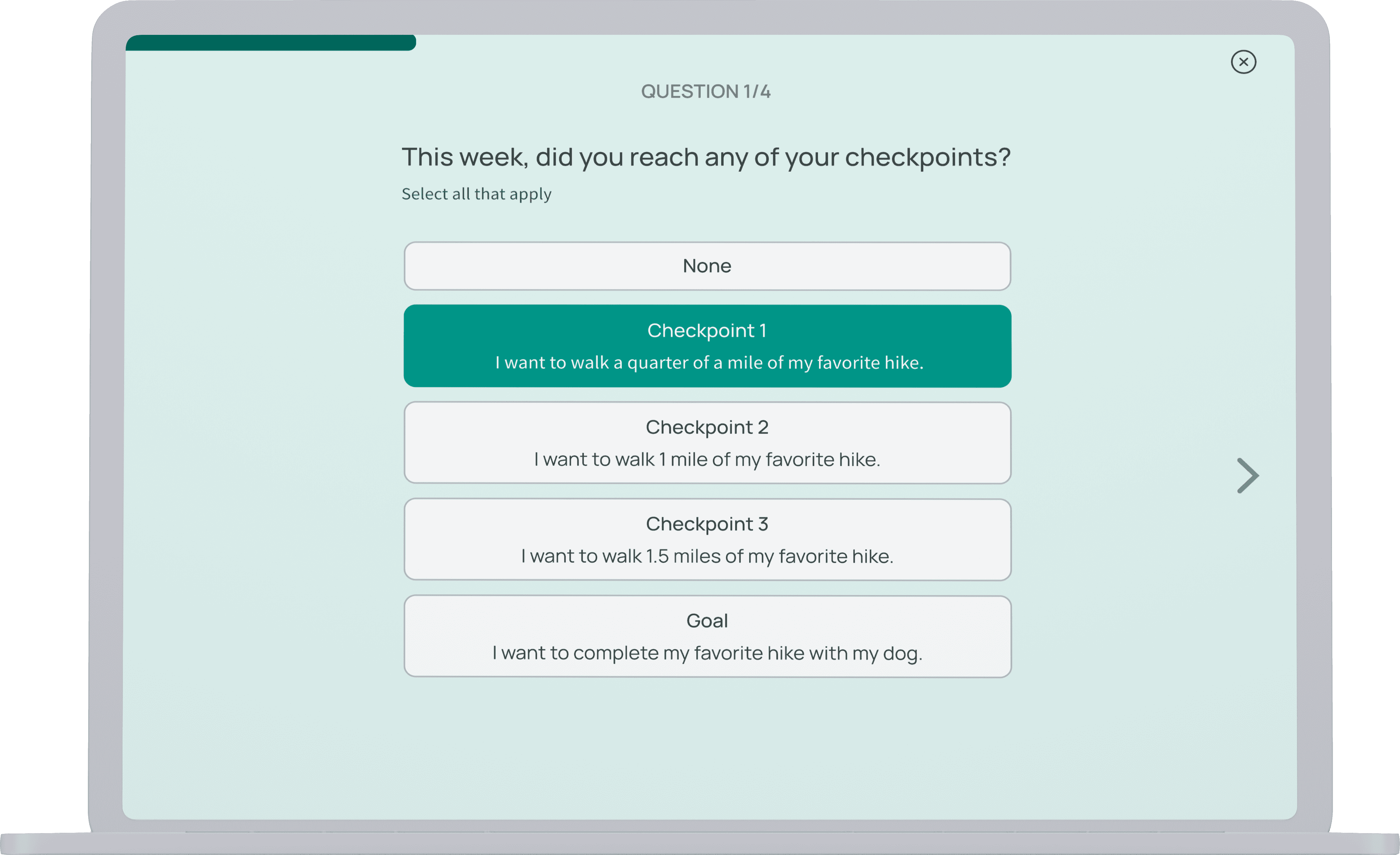
Select what you’ve achieved and see what’s ahead
Patients start by updating us on what checkpoint they’ve reached this week
Rate your progress
Our solution lets students easily create events for their mentor. Once accepted these show up in the tasks feed in the home.
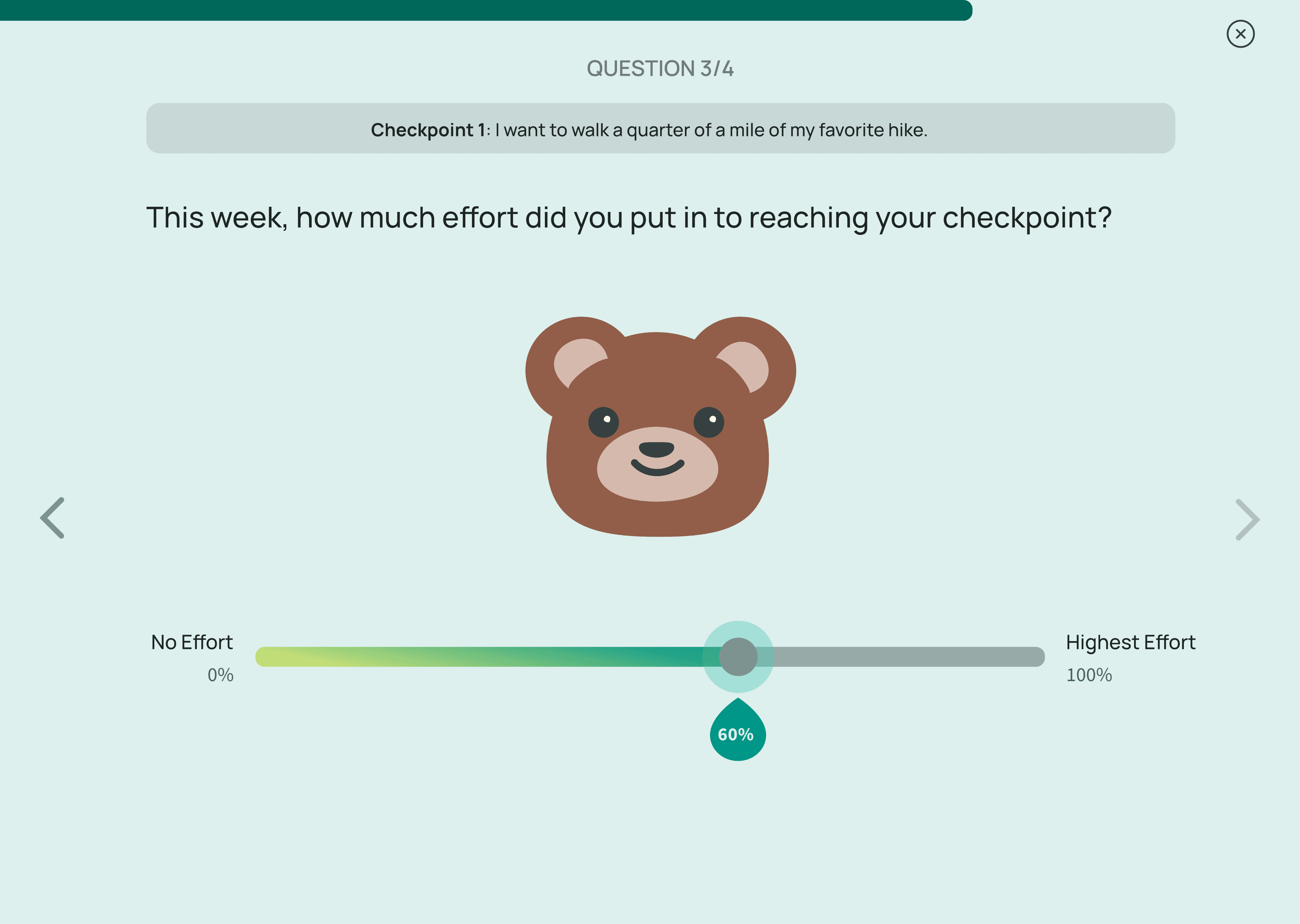
Log your weekly effort
This gives patients an opportunity to log the effort they’ve been able to put into recovery each week, a good talking point to share with their provider
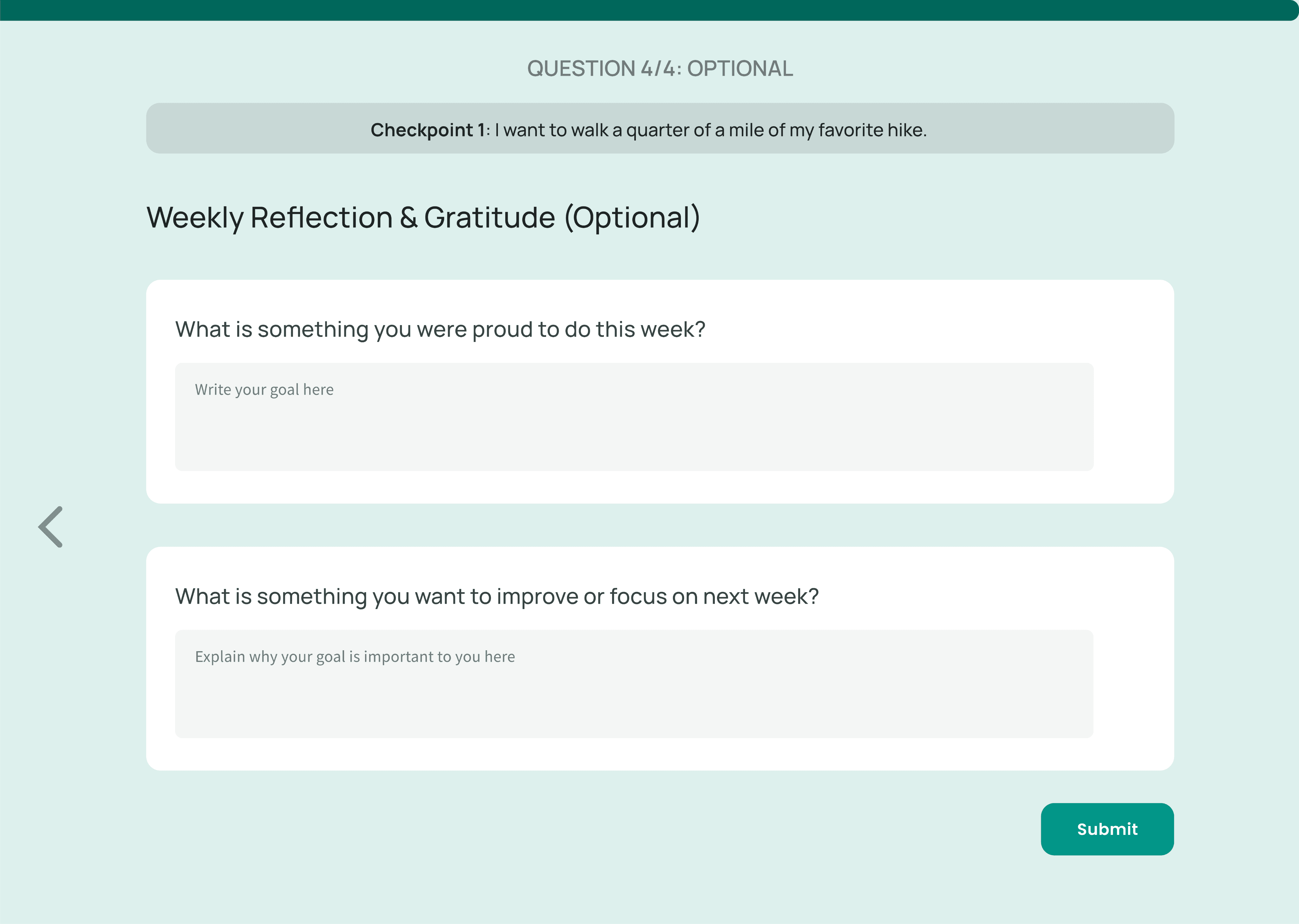
Optional reflection
Private to the patient, this provides them an outlet to talk about how recovery is going for them. They are able to log important “firsts” and look back over time
TEST
Key performance indicators
We carried out 6 usability tests online using UserTesting.com to see what potential patients thought about our goal platform. Our key performance indicators were: quality of goals set (rated by our clients after), how likely they were to use it, task completion rate, and NPS.
18
Net Promotor Score
77%
Task completion rate
62%
Goals more compliant with clients standards
Here’s what patients had to say
“I love this platform! It feels really engaging and I think it would make me more motivated if I went through surgery again.”
“I do not like the bear at all. I am an adult, not a kid.”
“I really just want to get my life back. It’s great that this platform is focusing on that. I’d love to use it.”
REFLECTIONS AND NEXT STEPS
Reflections
I loved this project because of how how much collaboration there was between developers and designers and since it was my first time officially mentoring.
Des/dev collaboration
Working with developers highlighted the need for flexible problem-solving. Our initial UX solution wasn't technically feasible, so we collaborated to create an alternative that maintained the user experience while being implementable, emphasizing the importance of adaptability and open communication.
Mentoring and project scoping
Leading the design portion taught me the importance of balancing project requirements with achievable timelines. Mentoring new designers improved my leadership skills as I provided guidance and fostered a collaborative environment for team growth.
Creating a creative space
To start the term, we had some team dynamic issues between the designers and PM. I worked to address this issue with open communication. From this, I learned the importance of psychological safety in teams and what makes a collaborative and creative space.
Next steps for mGAME could include...
Additional testing
I would like to do more testing, specifically seeing if the bear adds anything. Looking back, I am not the biggest fan of the bear either. Sometimes I wonder if maybe my designers and I just needed an extra bit of cute motivation in our lives.
Data analytics after shipping
I'd also like to use data analytics to analyze retention over time. Further user research could be done to identify who is most likely stop using the platform and why.
Mobile version
Our partners wanted just a website since it is only used once per week. It could be interesting to turn it into an app and see how we could up the weekly usage.

