Connecting STEM students with alumni mentors
ConnENGS App
My Role
As part of a capstone project for a UI/UX design class, I worked with another designer to find a problem relating to the prompt "bridging generations" through user interviews and research, then following the design process to create a novel app addressing the problem we found. Some of my favorite parts of this project where the challenges I faced when prototyping a social media app based around quality rather than quantity of connections and usability testing! Enjoy reading :)
Skills
User Interviews
Rapid prototyping
Usability testing
Tools
Figma
FigJam
UserTesting.com
Team
2 Designers
Time
Context
CONTEXT
Connecting Dartmouth generations
ConnENGS was created as a capstone project for Dartmouth’s class on UI/UX (taught by Lorie Loeb and Natalie Svoboda!). Our challenge was to design an experience to bring generations closer together. My partner and I wanted to look at how Dartmouth students and alumni could better connect to one another through networking
PROBLEM
Networking is challenging for minority students in STEM
LinkedIn is the most commonly used networking tool for Dartmouth students and alumni. However, minority STEM students often feel discouraged due to a lack of representation in their fields. These students spend excessive time on LinkedIn trying find people like them to connect with, only to frequently encounter unresponsive connections, leading to a repetitive and time-consuming process.
OPPORTUNITY
HMW
Help minority STEM students build a professional network in a less time consuming way?
Networking made meaningful
Solution
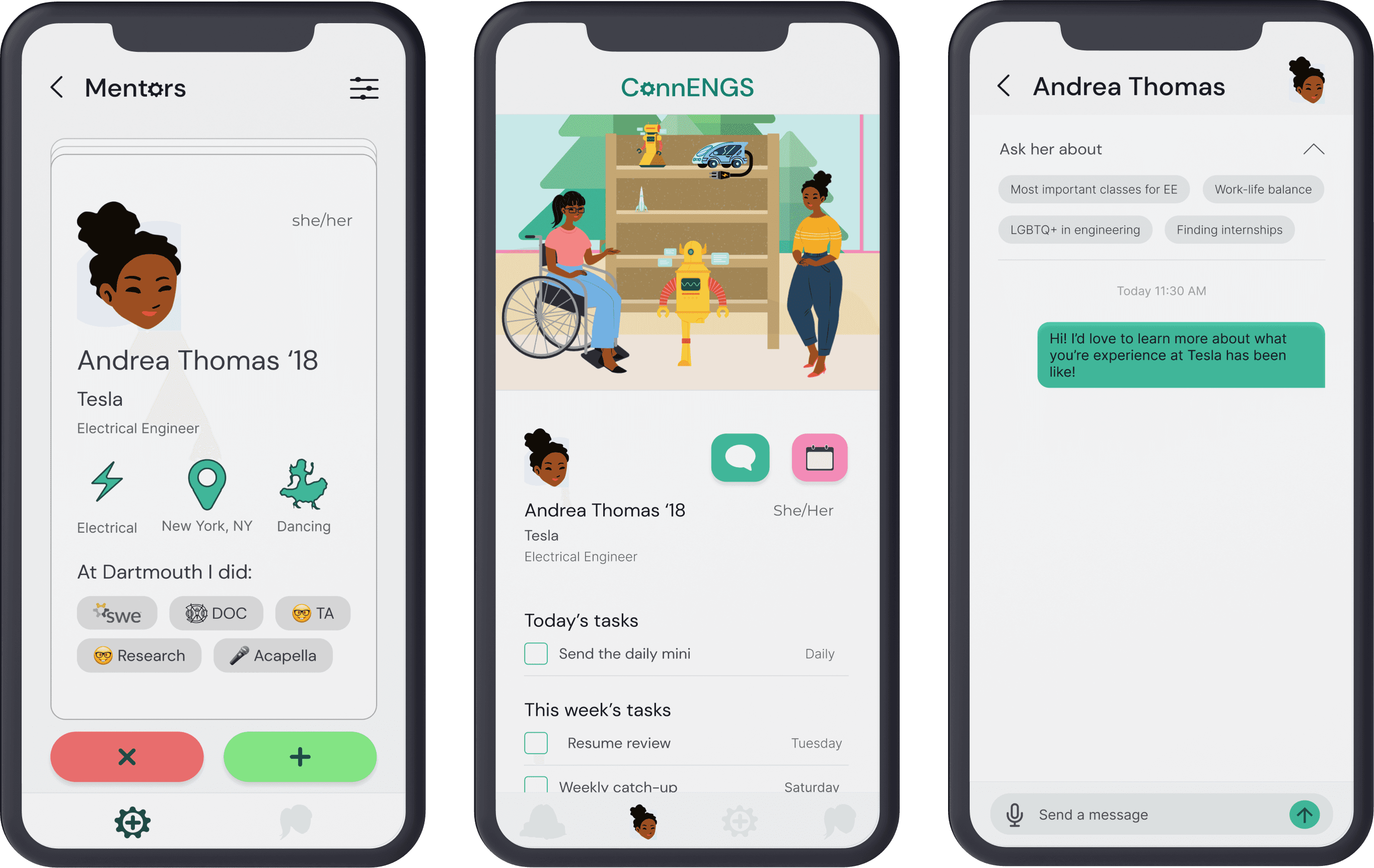
ConnENGS is a mobile app that connects minority Dartmouth STEM students with alumni of similar backgrounds to foster meaningful relationships.
Design Process
research
Students need to network, alumni want to give back
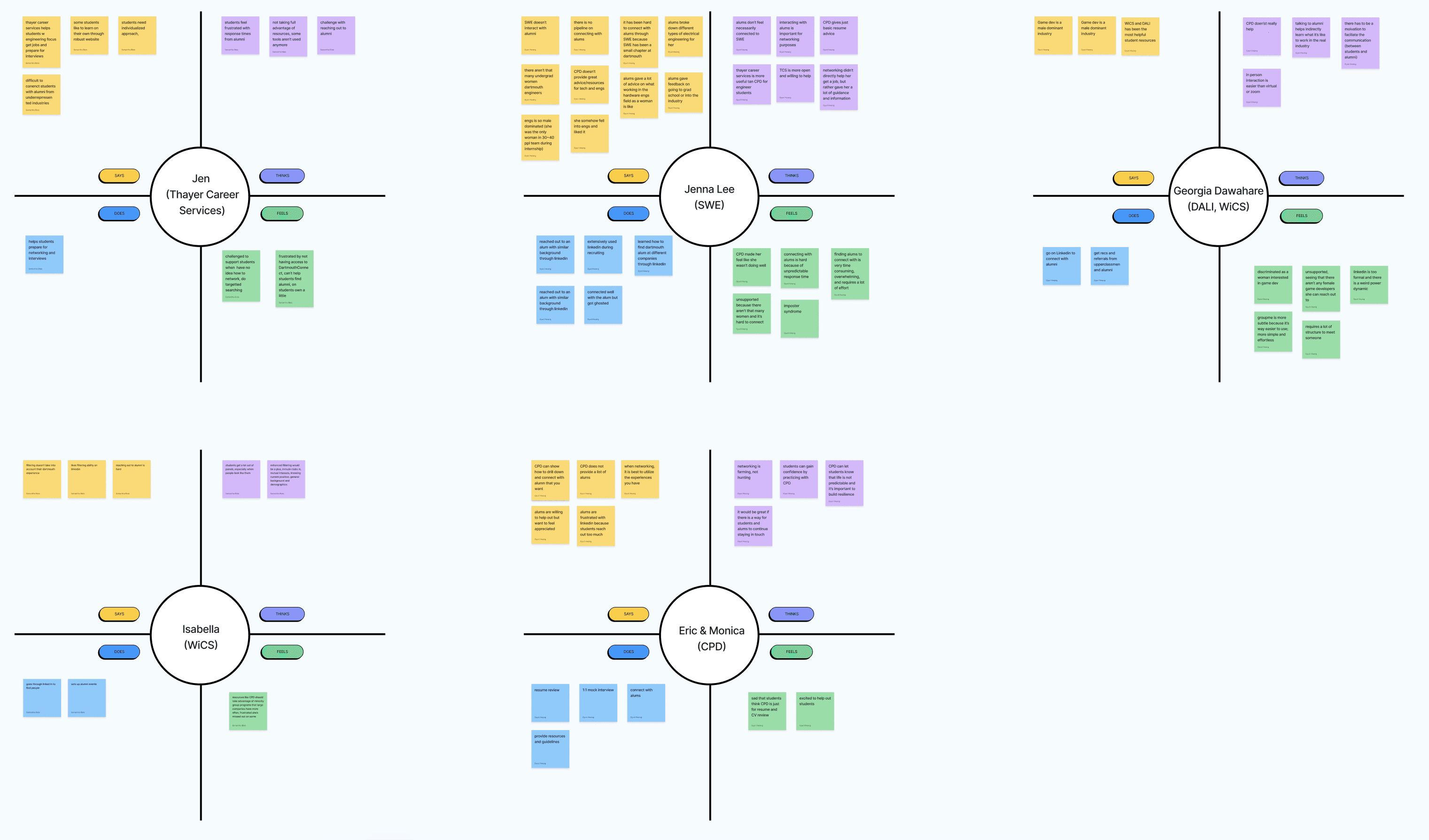
First we were interested in student-alumni networking in general, so we started out by talking to 3 students. Our first interviewee struggled as a budding female engineer to find people who were like her in the specific fields she was interested in.
My partner and I were interested in this problem and decided to narrow in on it for the rest of our interviews. In addition to the 2 other minority STEM students, we also talked to 3 career service professionals in the engineering department and Dartmouth’s career services.
Empathy Maps
Define
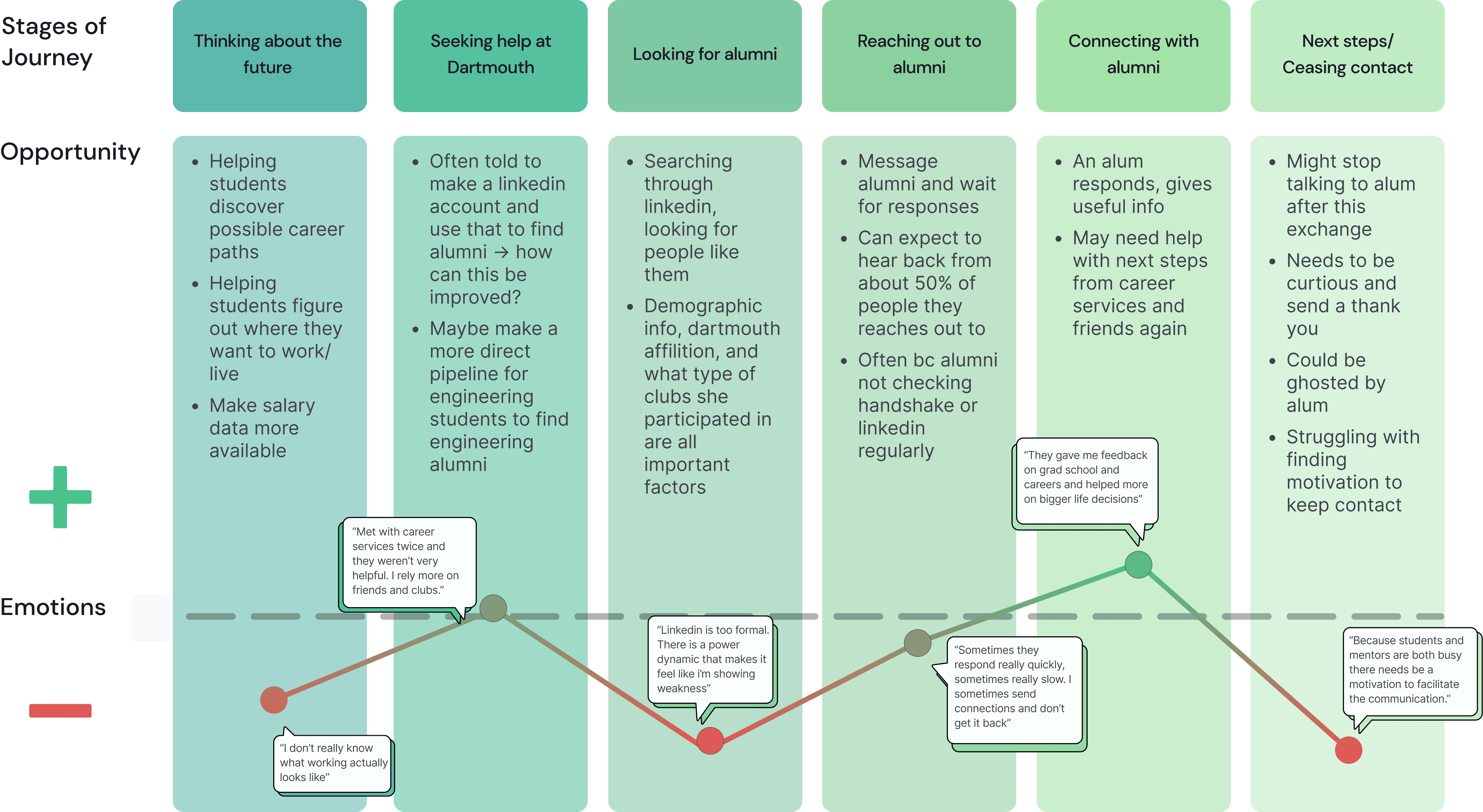
Understanding the student journey in networking
To synthesize findings from card sorting, I made logged and graphed the changes users made and how often they were made based on the number of students who saw those tiles.
Why is it hard to make meaningful connections?
As we made sense of our research, we noticed that challenges with connecting to alumni boiled down to 3 main factors:
Time
It’s time-consuming to find people who are similar to you when you are a minority in your field
“Finding alumni to connect with is very overwhelming, and just requires a lot of effort.” - GD ‘23
Decreased confidence
Going through so many profiles of people who aren’t like you increases feelings of imposter syndrome
“I felt really discouraged because there were so few female game developers to reach out to.” - LP ‘23
Lack of incentives
LinkedIn connections often lack follow-through
“Alums want to give back to students but there is no structure to make it easy for both of them.” - TE
Research takeaways
1. Students and alumni want to connect
Students want to hear about work life and alumni want to share what they’ve learned
2. It’s time consuming to find someone
Minority STEM students spend an excessive amount of time finding people to match with on networking platforms
3. Current platforms prioritize short-term over long-term relationships
Lack of incentives to keep people in touch leads to ghosting
HMW
Incentivize STEM students and alumni of similar minority backgrounds to build meaningful relationships?
Ideate
Brainstorming and feature prioritization
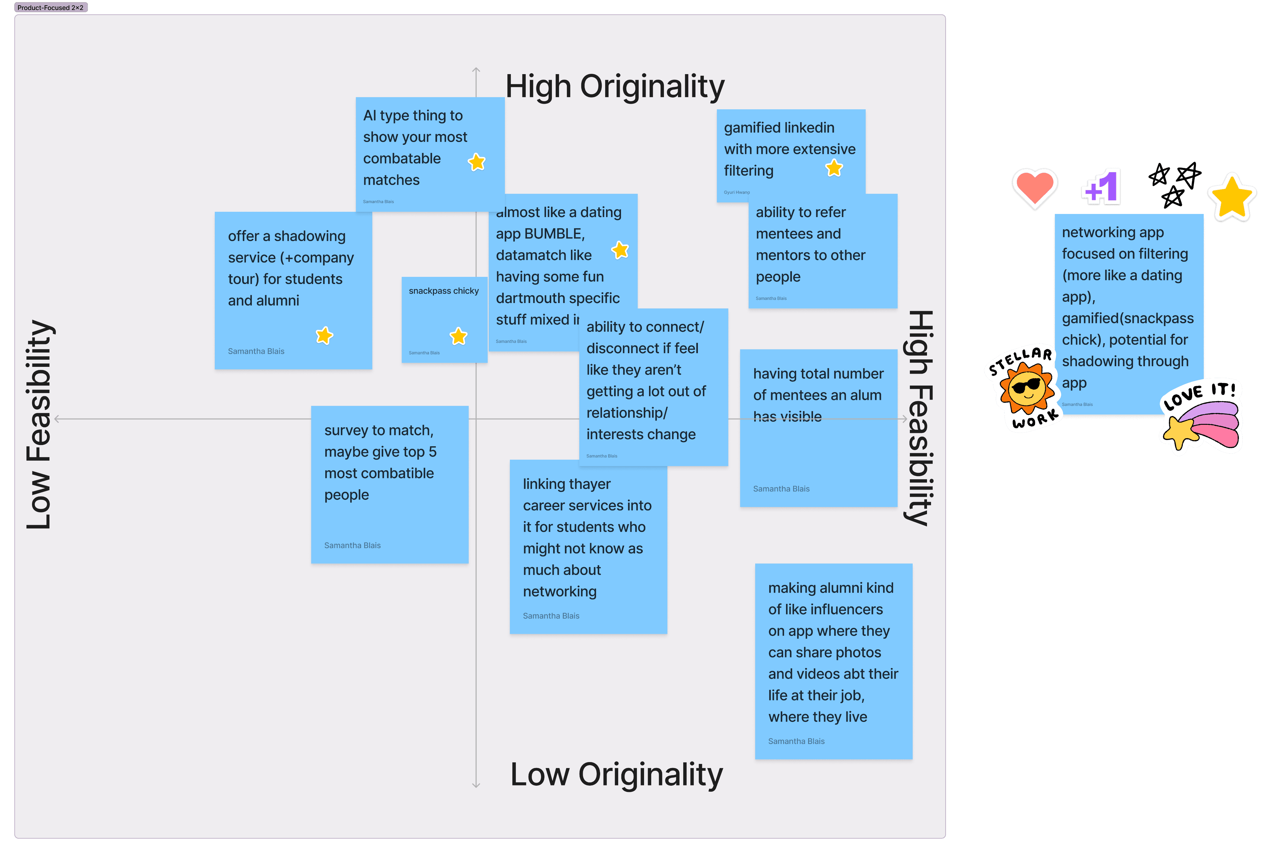
My partner and I brainstormed, drawing inspiration from industry favorites (like the beloved Snackpass chickens) and our wild ideas. We then mapped our top concepts onto a feature prioritization matrix to decide what to pursue.
Considering the constraints of our capstone project (digital solution, two-week timeline) and our excitement, we decided to create a gamified, easily filterable, swipe-based networking app.
Sketches
We used Crazy 8s to generate ideas. In our second round after sharing, we were most struck by the Tinder-like matching process for mentors and mentees to build something together.
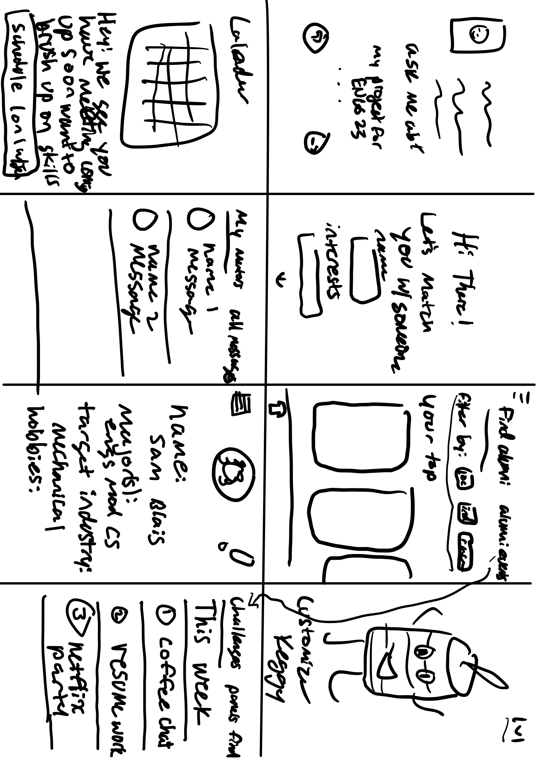
My first Crazy 8s (there’s a keg because our school’s unofficial mascot is a keg named keggy). We liked the idea of a mascot to show progress.
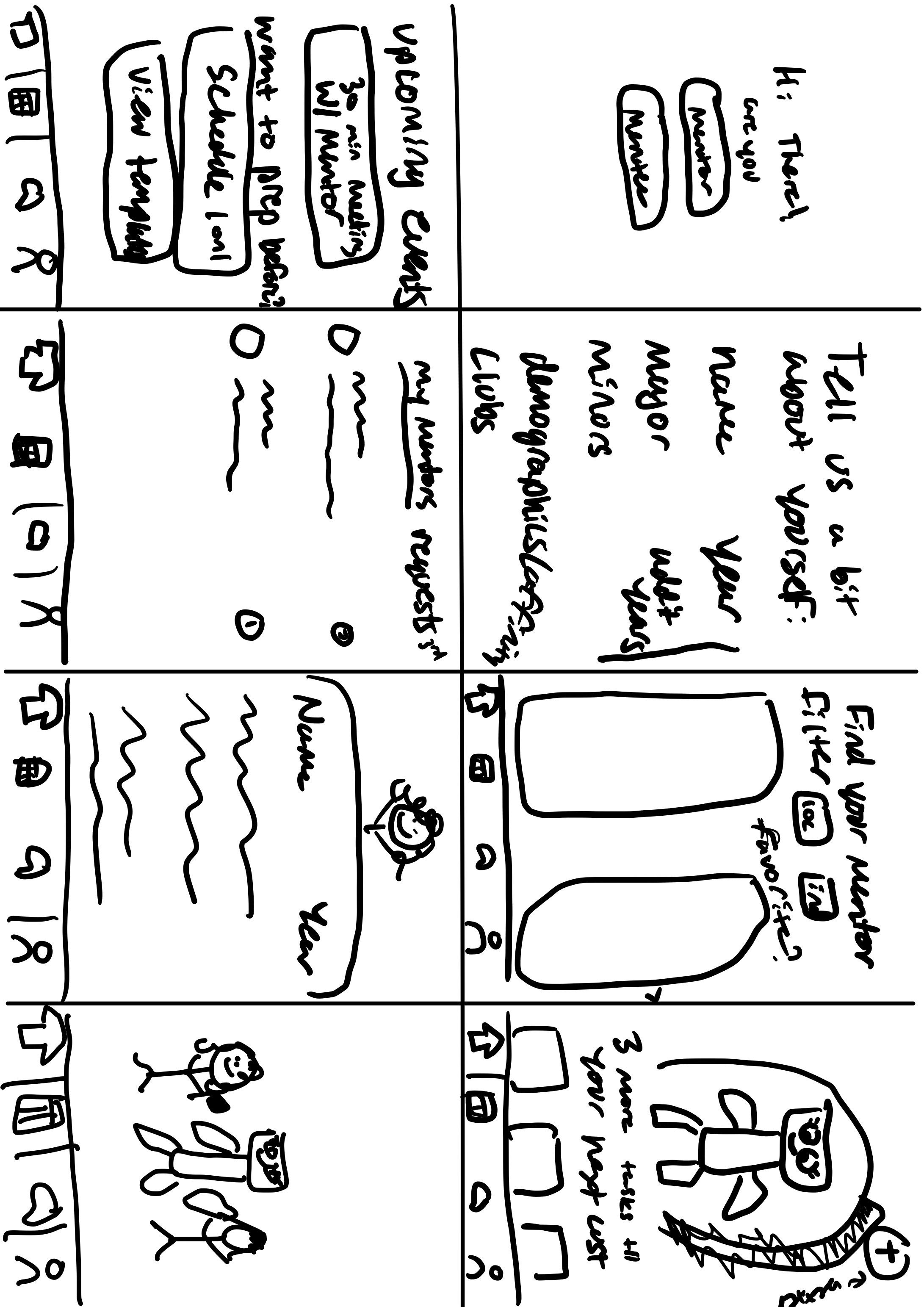
Second iteration after showing partner! I built upon the mascot idea to having them build something together.
Key features
Through sketching and brainstorming, we narrowed in on 3 key features of our app:
Matching process
We use a swiping process to encourage deliberation rather than mass adding
Facilitating connection
In-app scheduling and messaging to help mentees and mentors start connecting
Creating incentives
Mentors & mentees are rewarded for staying in touch by building things together
Prototype
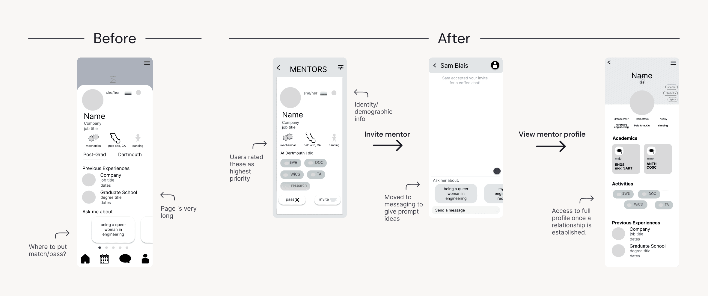
Design problem 1: information overload
As I started wireframes, I noticed fitting all the information students brought up in the interviews and what was on LinkedIn was a challenge on mobile screens. This led me to wonder:
HMW... Streamline the amount information in the matching process?
I reviewed our interview notes and identified what students said was the most important information when connecting with someone. Based on this, I prioritized details about where mentors worked and what they did at Dartmouth.
Design problem 2: excess empty space
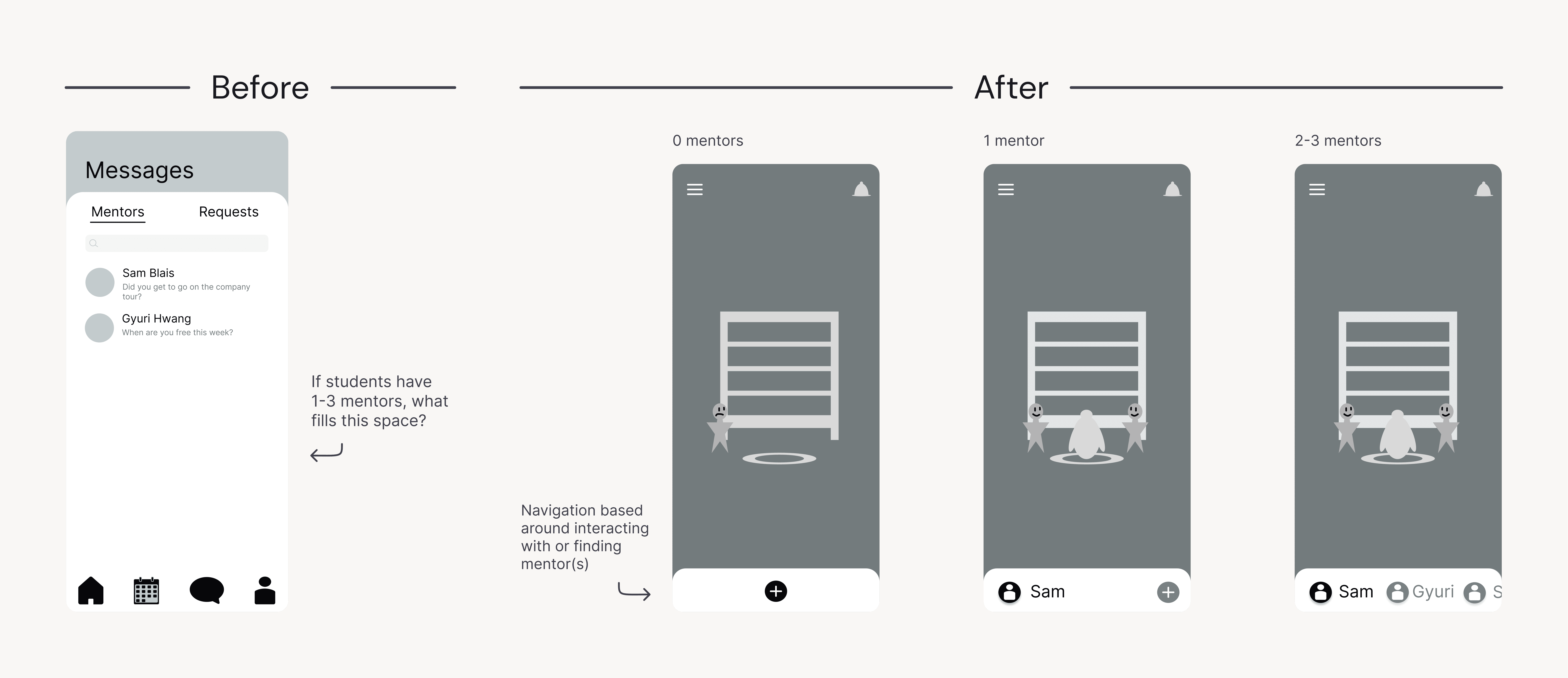
If we only want mentees to have 1-3 mentors, what do we do with all this empty space in the messaging app?
HMW... Value quality over quantity of connections?
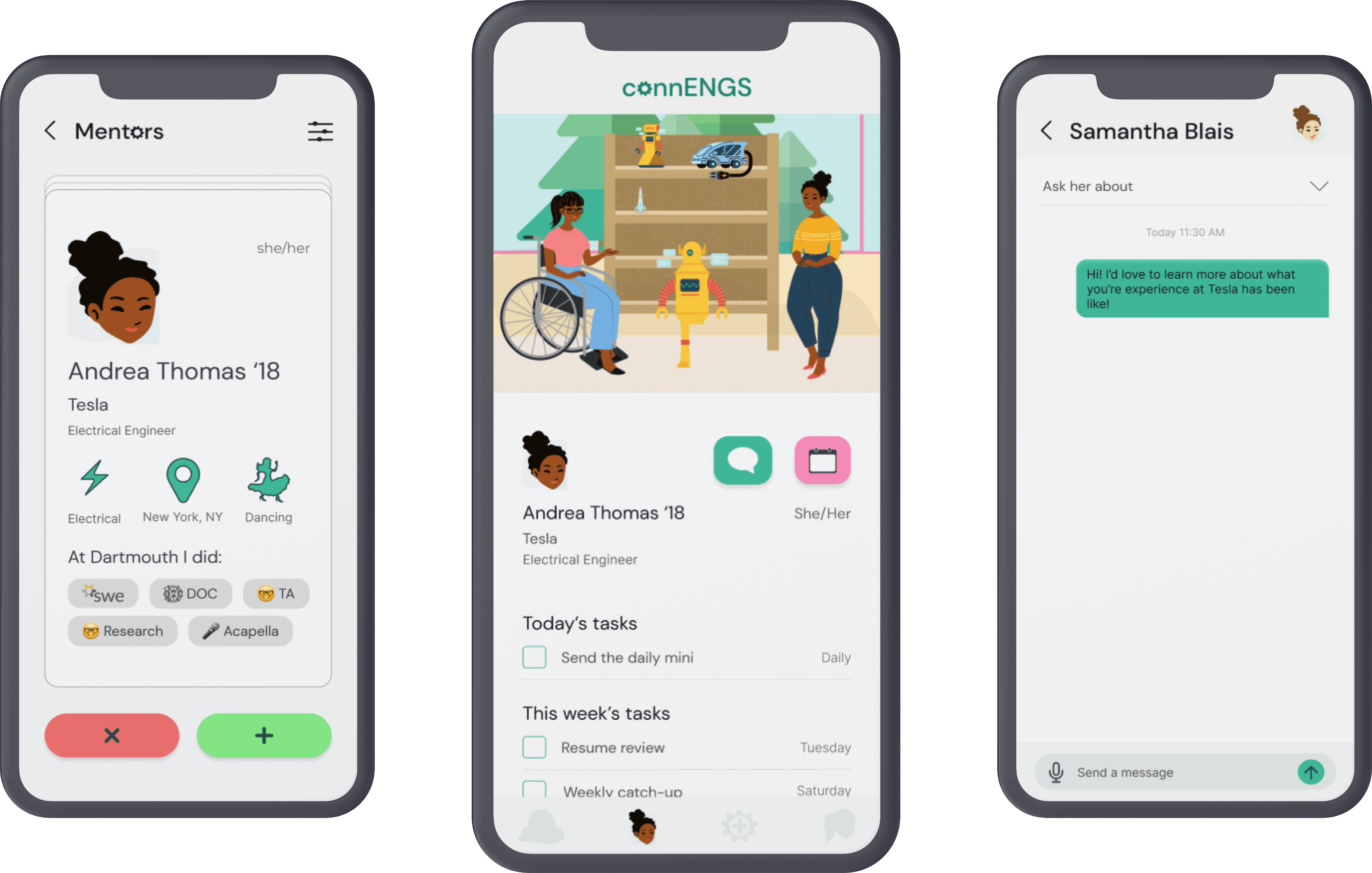
Unlike LinkedIn, our app aims to help users create 1-3 meaningful connections instead of hundreds. To support this, we had a radical idea: eliminate the traditional footer and center navigation around users’ key connections.
Grayscales
Test
Grayscale testing: Making mentor pages more interactive
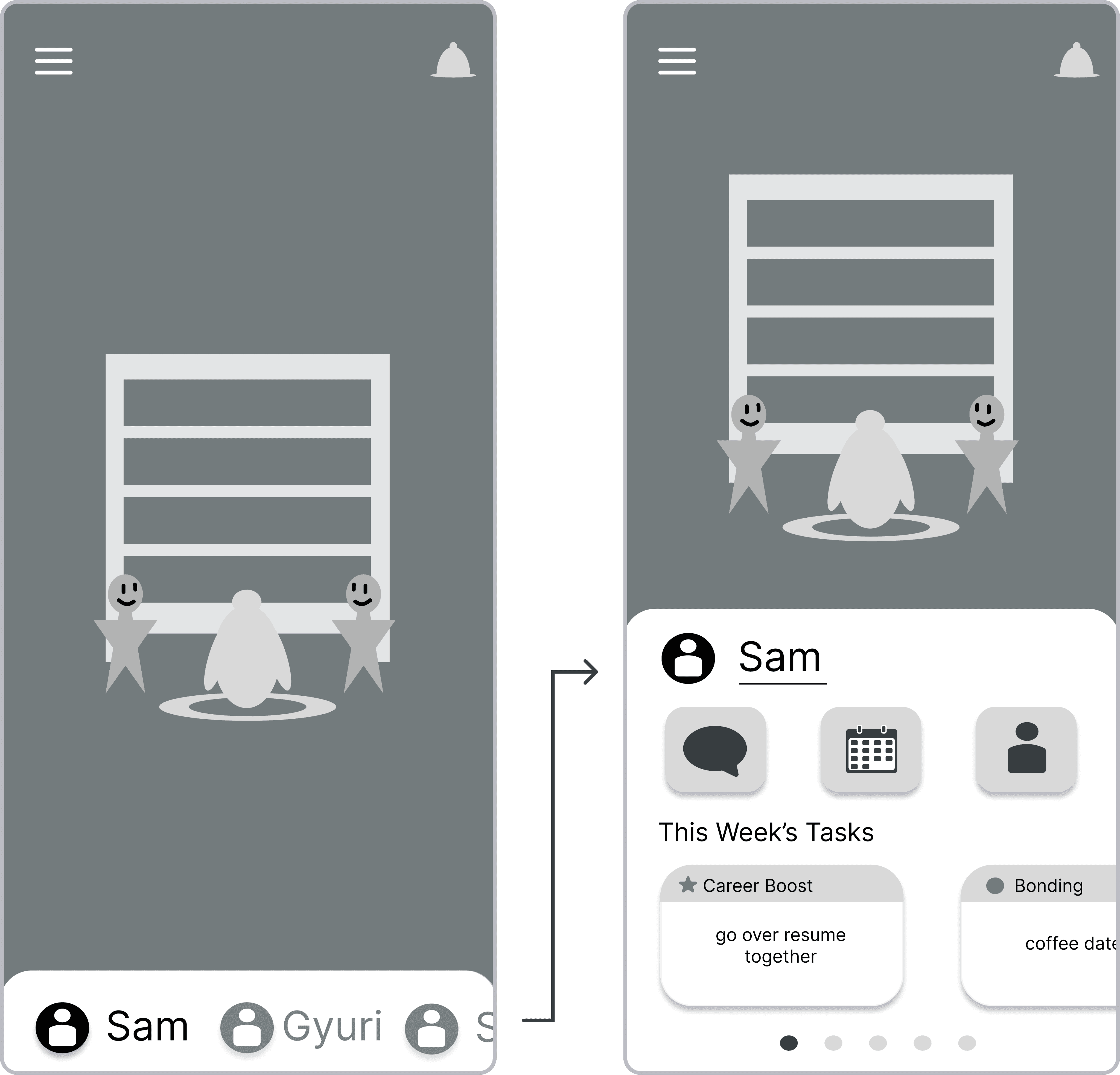
Several UI/UX designers in class noted that many key functions of the app require an upwards swipe to access.
To address this, I decided to cut the left screen and focus on further developing the right as the home screen.
HI-fi prototype: matching
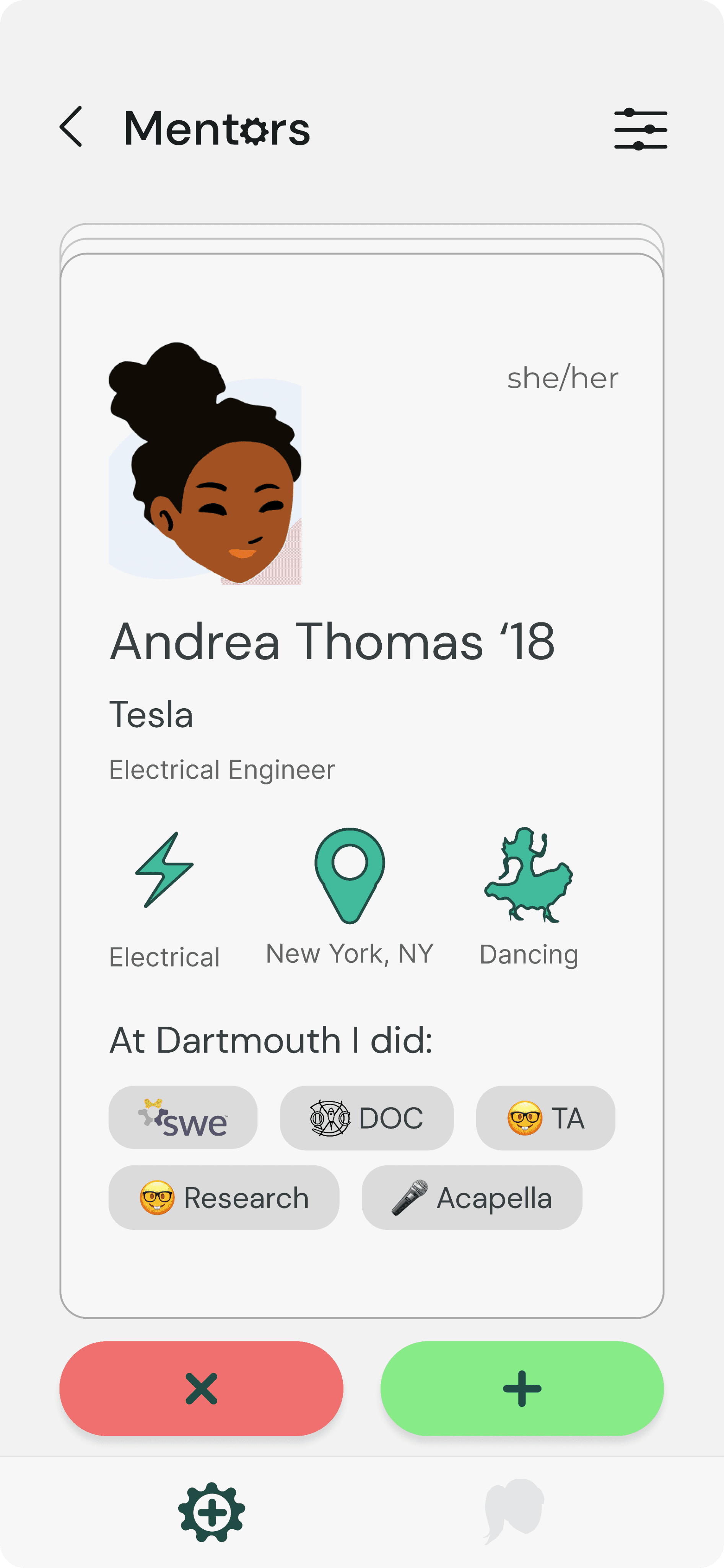
Cutting down time with a personalized match feed
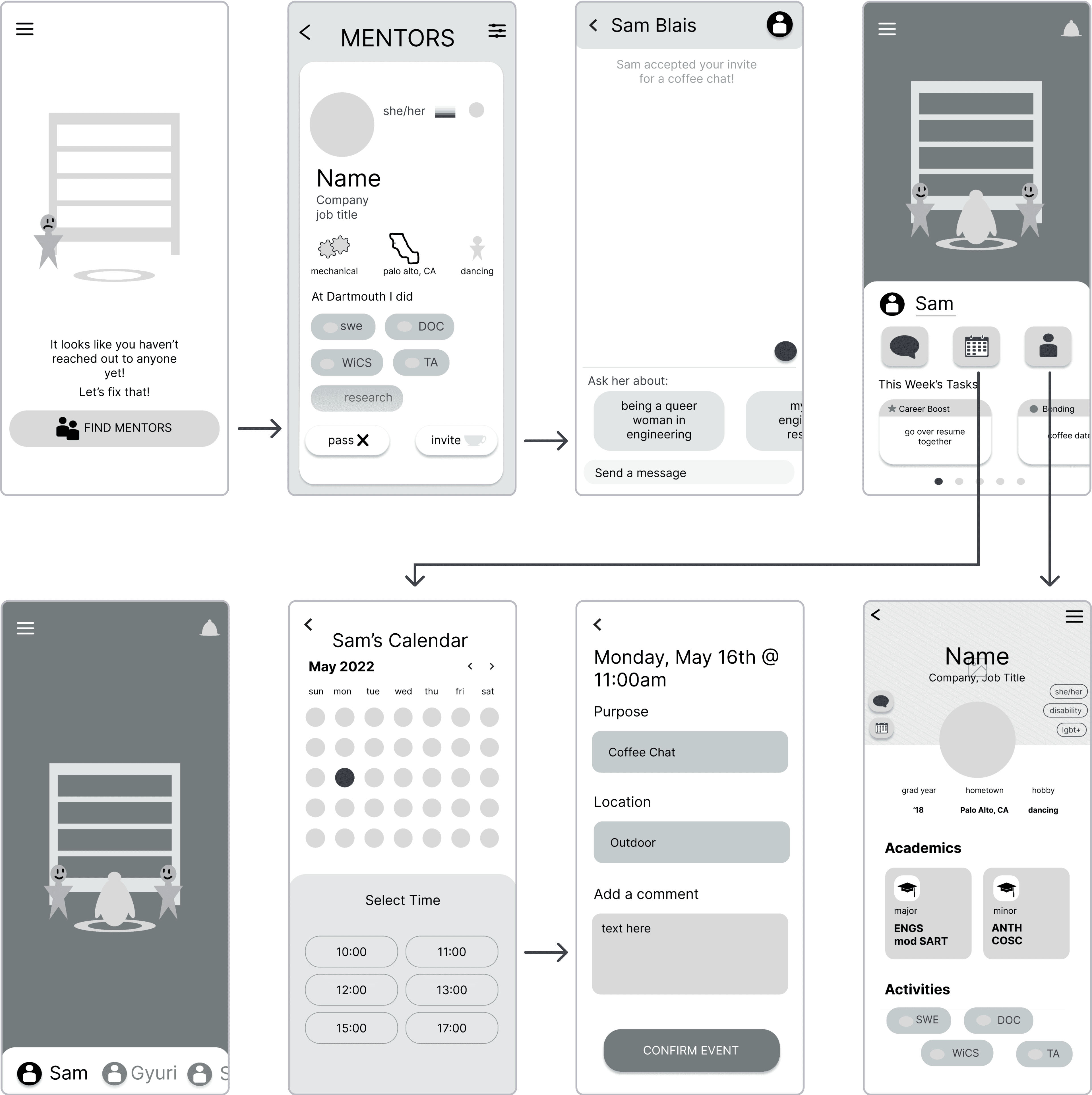
Students can match with potential selection mentors in a swiping fashion based on their profile and intro survey
HI-fi prototype: Scheduling
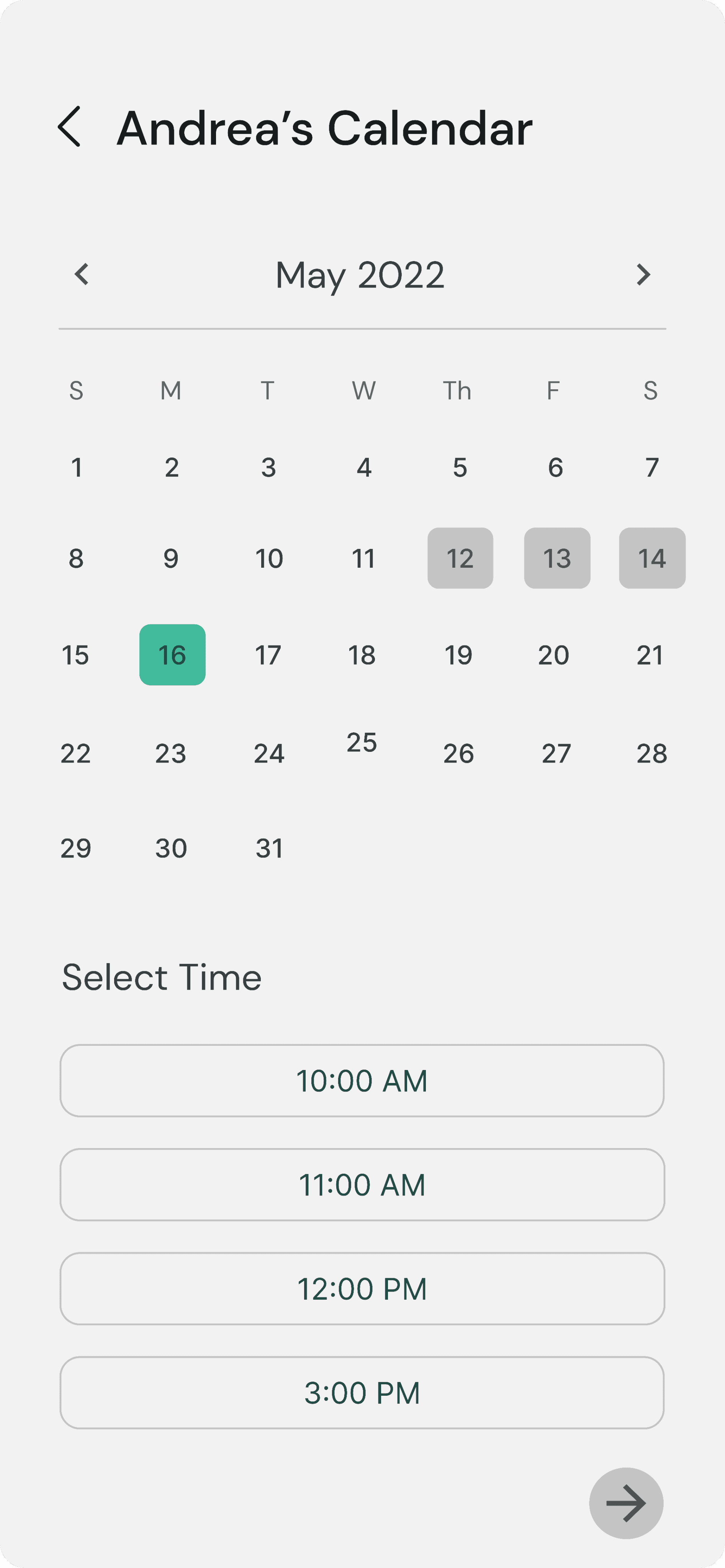
Making meeting quick and easy to schedule
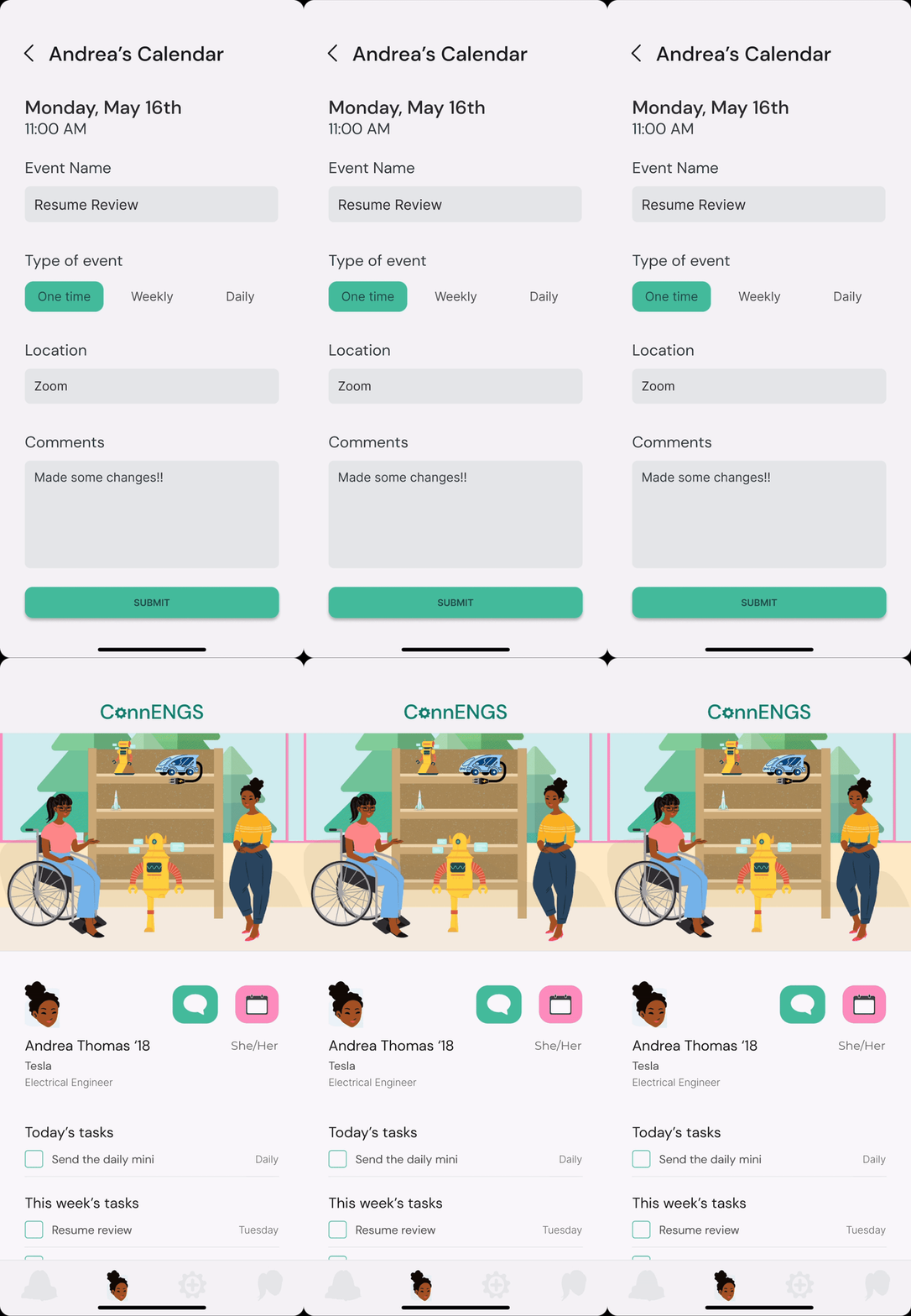
Our solution lets students easily create events for their mentor. Once accepted these show up in the tasks feed in the home.
HI-fi prototype: home screen
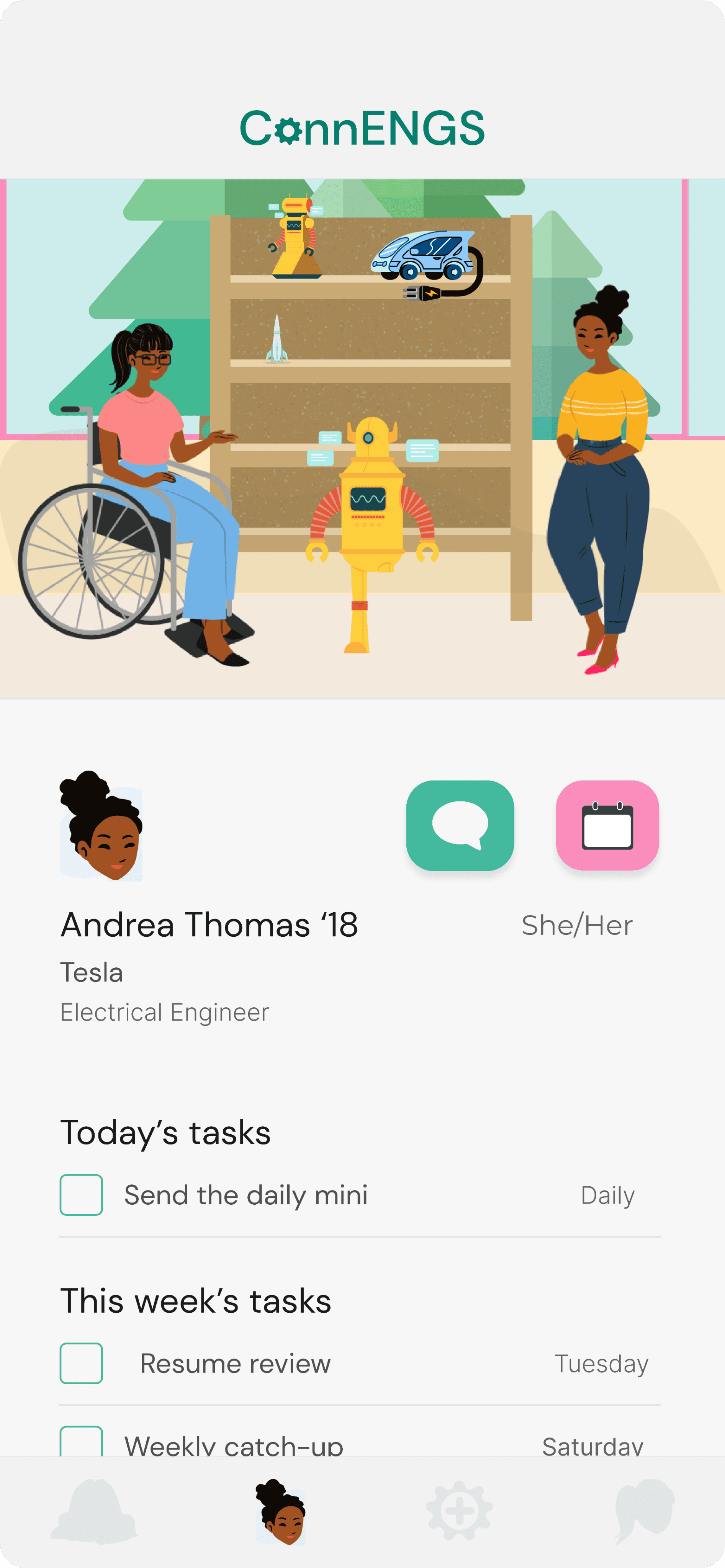
Building robots, rockets, and relationships
Upon completing tasks, mentee and mentors are rewarded by building a part of an object of their choice. When this is finished, it gets added to the trophy case of what they’ve made behind them.
TEST
Key performance indicators
For our testing we conducted 6 usability tests on UserTesting.com. Our key performance indicators were user satisfaction, measured as whether or not these users would use or recommend this app, and intuitiveness, measured as high task completion rates, confidence levels in completing tasks, and task difficulty ratings. Our users rated the app:
67%
User Satisfaction Rate
51
Net Promotor Score
83%
Task Completion Rate
My partner and I also got feedback on how to improve pain points of the app:
Adding confirmation
50% of users weren’t confident that they successfully scheduled a meeting since there was nothing showing it was saved.
No confirmation
Confirmation overlay
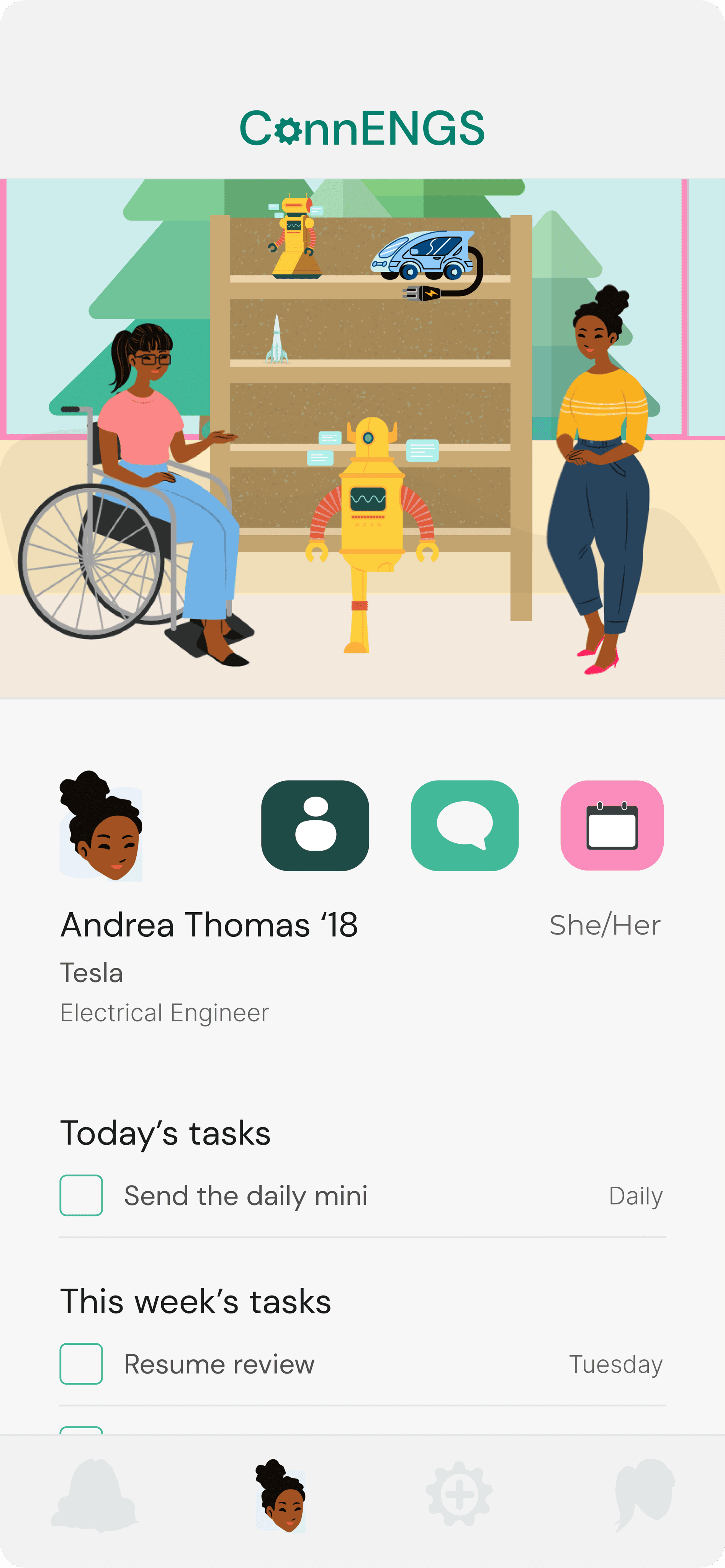
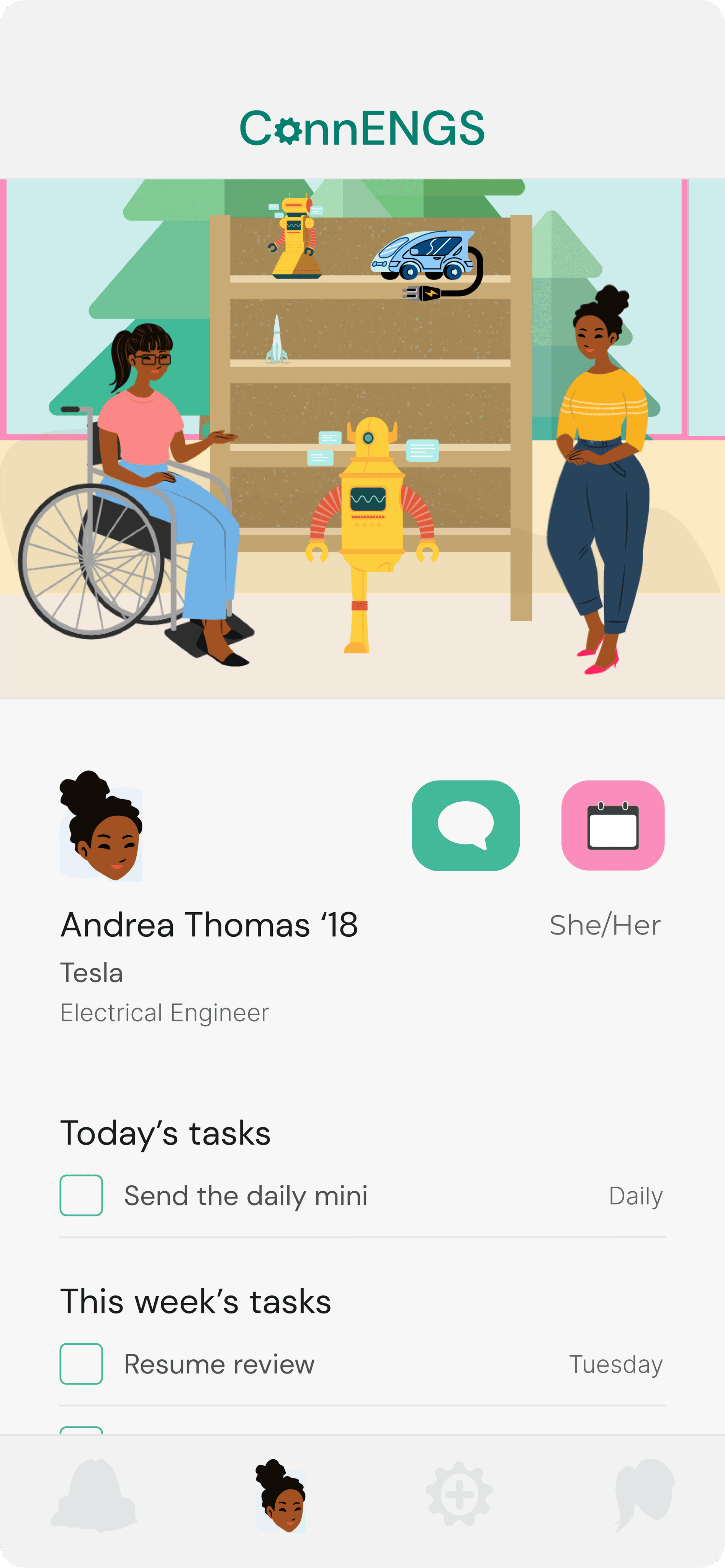
Removing the profile button
67% of users thought the profile button was unnecessary and instead would have preferred to click on the name of the mentor, so we got rid of the profile button.
Profile button
No profile button
REFLECTIONS AND NEXT STEPS
Reflections
I loved this project!! It was a huge hustle to get done, as my partner and I only had 2 weeks to work on it. But, after pouring in 30 hours, I was extremely proud and happy of the work I accomplished. This was my first full start-to-finish UI/UX sprint ever and it shaped me as a designer by:
The value of niche user groups:
Initially overwhelmed by the broad scope, we narrowed our focus to minority STEM student and alumni networking, leading to a novel and exciting idea. Sometimes, exploring the edges of problems yields the best results.
Teaching me how to receive feedback:
I used to struggle with attaching my work to my sense of self, but this project's excitement taught me to see feedback as opportunities for improvement. This product-driven mindset has greatly benefited my design process.
