Utilizing participatory design to redesign a student portal
Dartmouth IT & DALI Lab
My Role
Over the course of a 10 week project, I devised a research plan to pin point areas of confusion on Dartmouth’s current student portal, DartHub. Along with another designer, I designed solutions addressing 3 of the most problematic areas in the portal, and formulated a new design decision for the portal which we handed off to Dartmouth’s ITC service.
Skills
Team
Tools
Time
Background
DartHub, Dartmouth’s student portal, is getting redesigned by Dartmouth IT
DALI partnered with employees at Dartmouth’s IT service to help redesign the student portal, DartHub, used by all 6,300 undergraduate and graduate students at Dartmouth for tasks like registering for classes, getting housing, and viewing grades.
Problem
DartHub has 2 key usability issues:
Tile icon confusion
IT wanted us to see how these icons could be more intuitively depicted for students navigating DartHub
Dated design system
IT wanted us to update the design system of the DartHub webpages to something students would find easy to use
Opportunity
HMW
Minimize usability issues faced by students navigating DartHub?
DartHub’s new design system
Solution
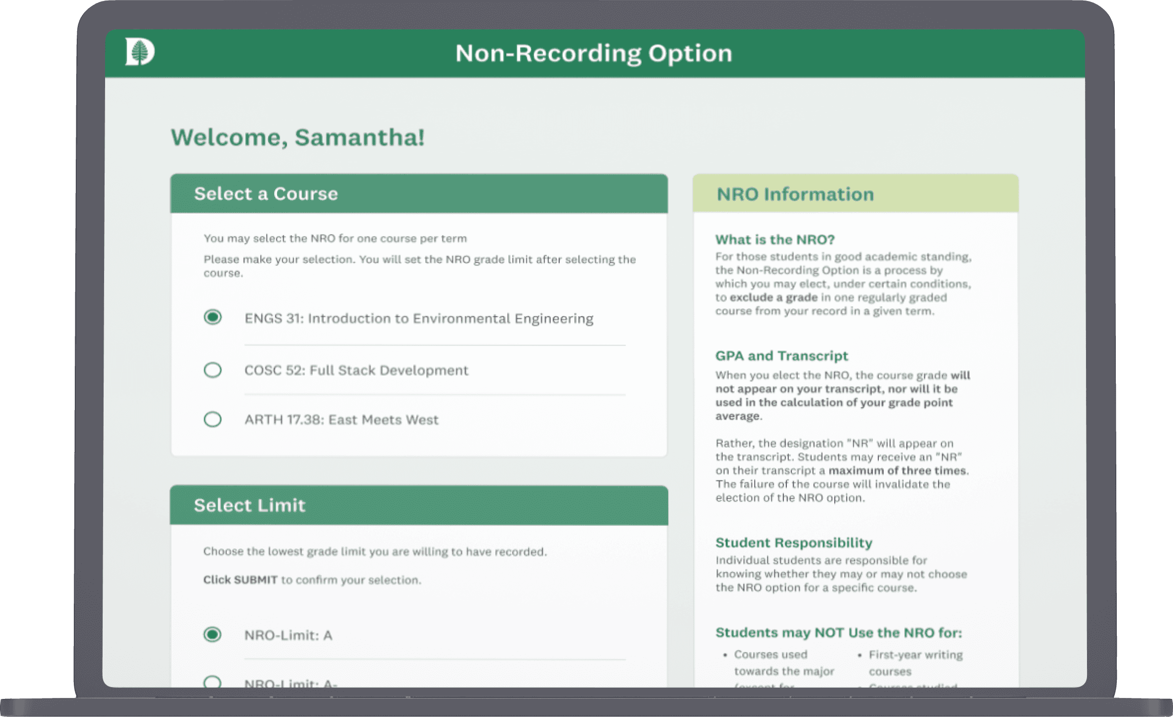
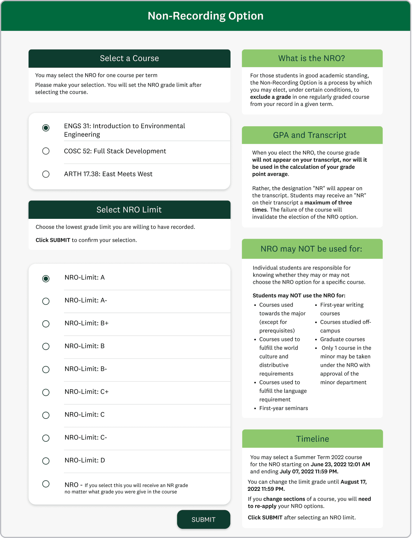
My partner and I crafted a new design system, shown on 3 redesigned pages of DartHub.
research
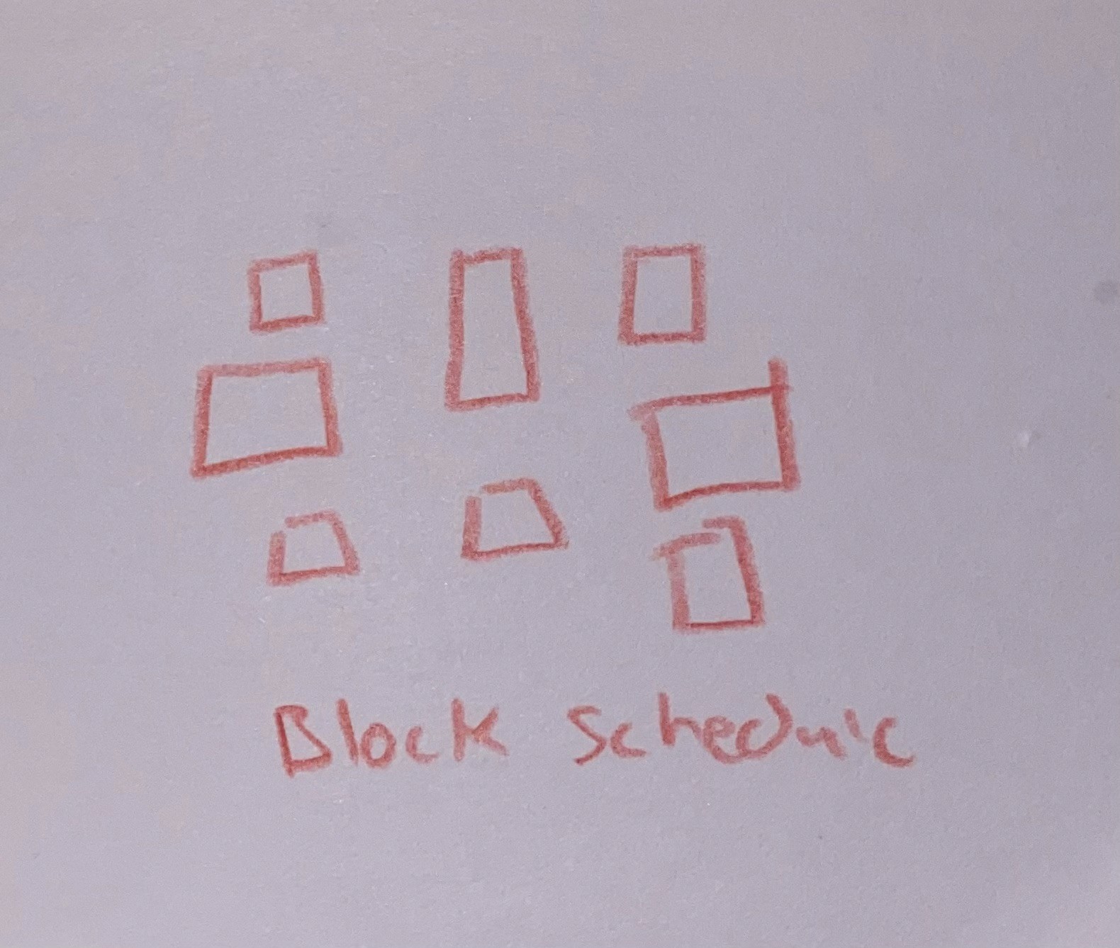
Letting students design tile groups
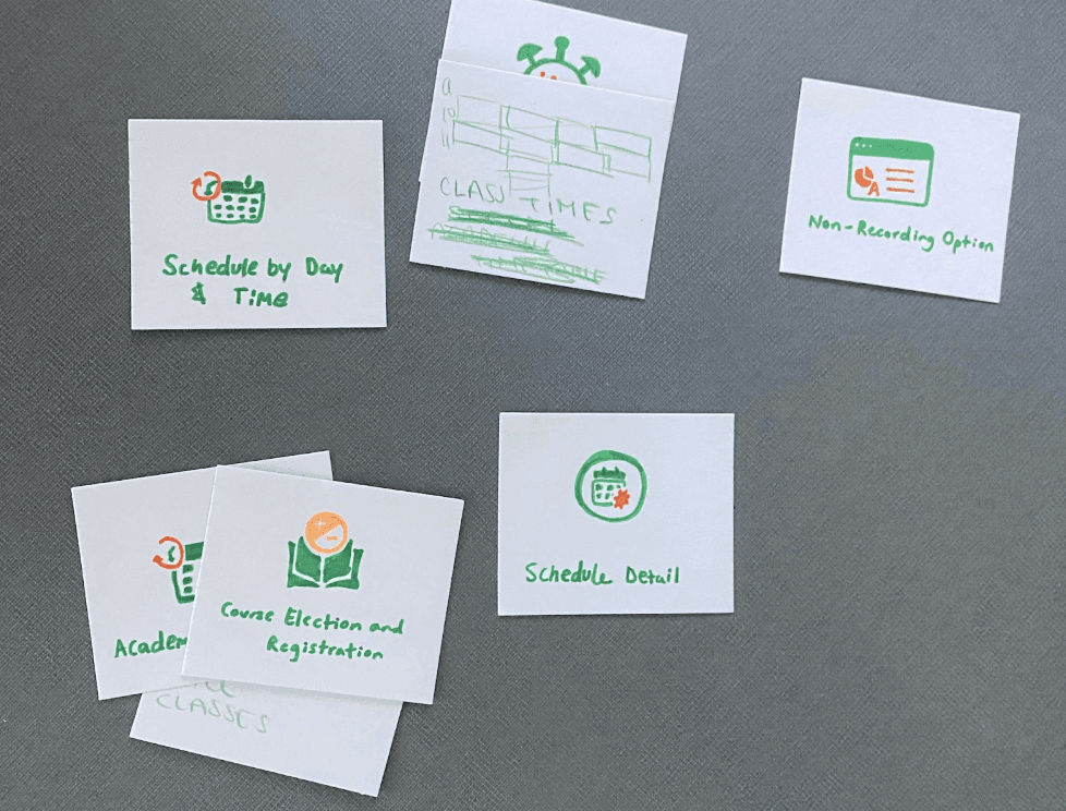
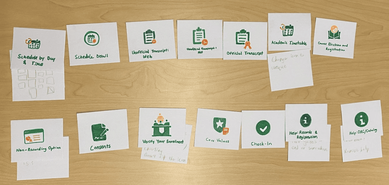
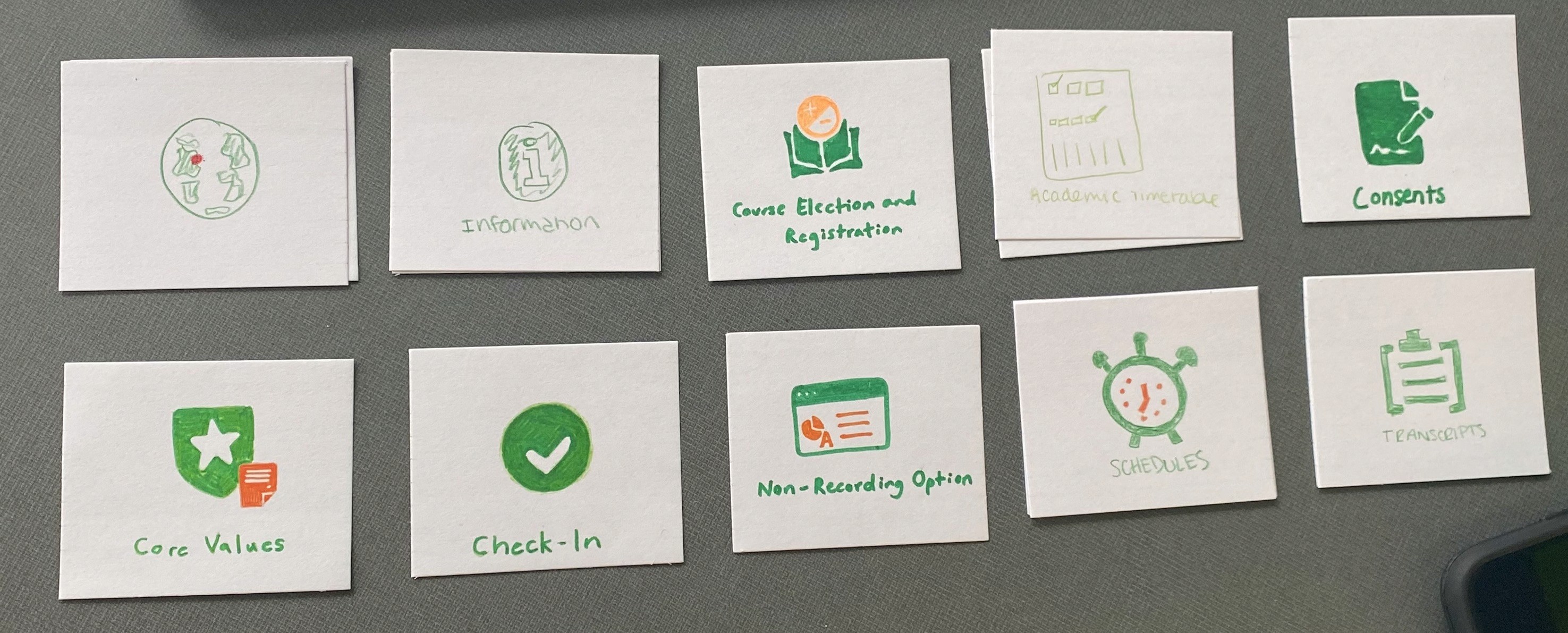
With tile icons being a point of confusion, I saw this as an area of opportunity to utilize card sorting to see how students would prefer to have pages grouped and depicted as tiles. I let them rename, regroup, and redesign icons as they liked.
I supplied interviewees with pre-cut index cards, markers, and colored pencils. I ran 5 interviews. For 3 interviews, I had them do all tiles in that specific section of DartHub, and for 2 I had them do half the tiles. What they designed is shown below!
Student insights on page designs
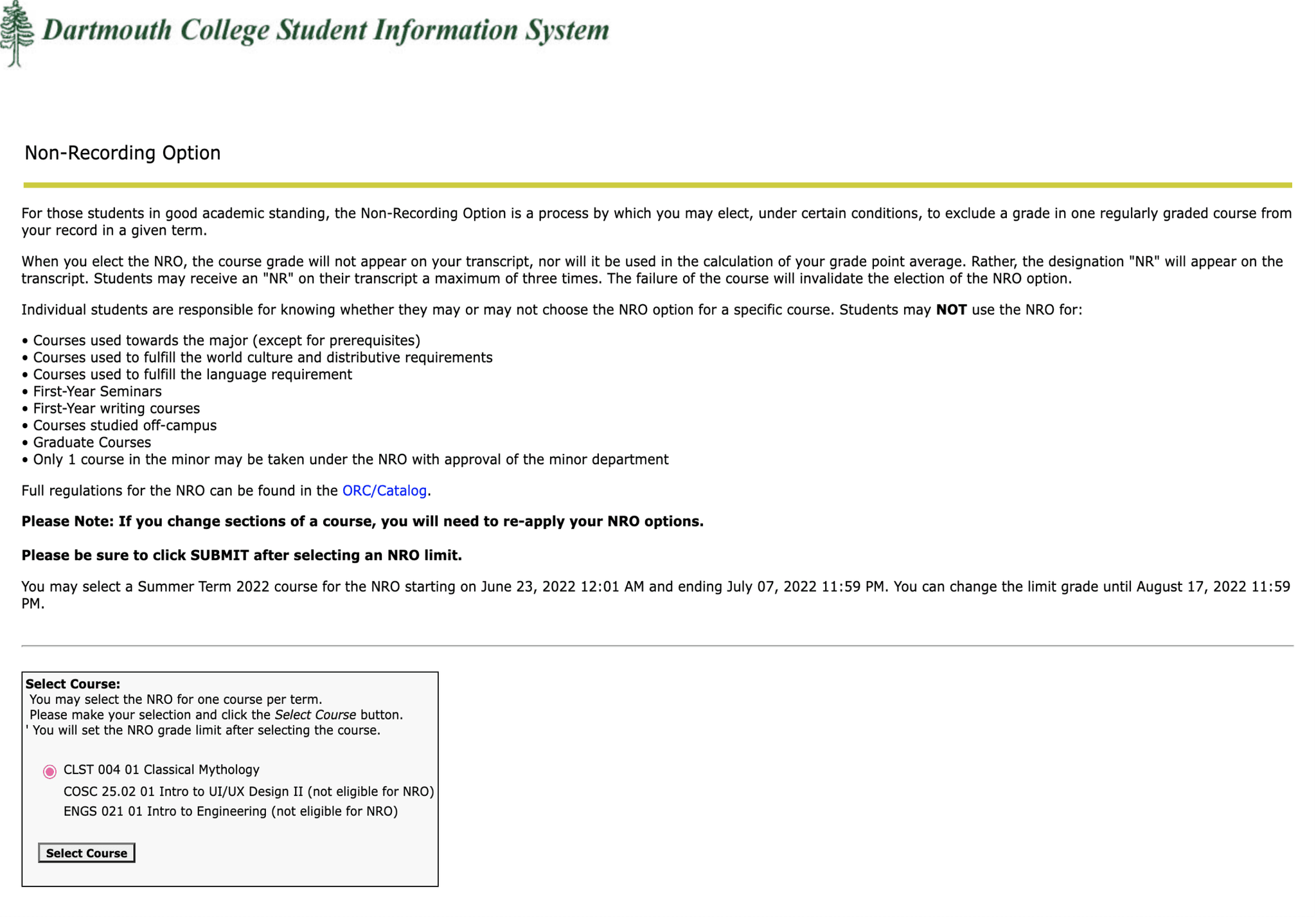
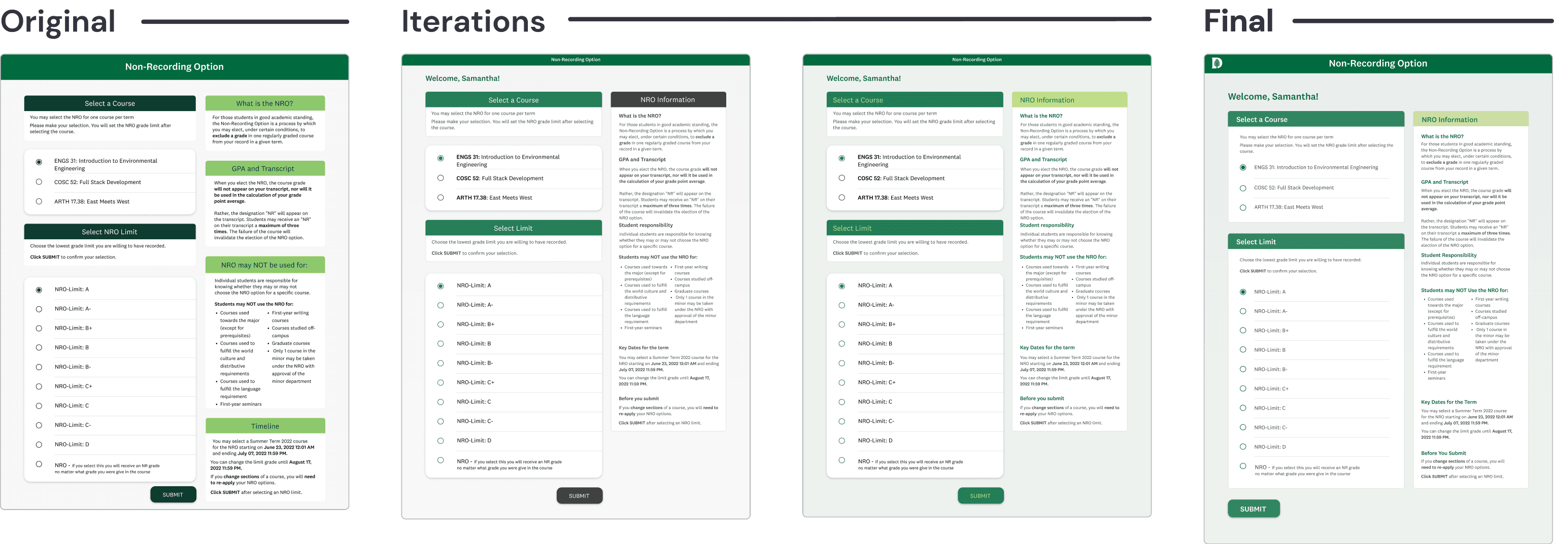
Students also gave feedback on the Non-recording Option page (our version of taking a class pass/fail):
"These pages always seem so jarring compared the home."
3/5 didn't like different styles across the portal.
"I honestly don't even read the text most of the time."
Students noticed the lack of visual hierarchy.
"I know what I need to do, just let me do it."
Students familiar with DartHub get annoyed with the time it takes to do simple tasks.
Define
Analyzing student artifacts to understand information architecture issues
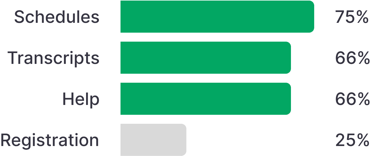
To synthesize findings from card sorting, I logged and graphed the changes users made and how often they were made based on the number of students who saw those tiles.
Over 66% of students made new tile groupings.
Students struggled distinguishing between the different schedule and transcript tiles.
New groupings made
Recommendations to our clients
Based on the research I suggested multiple areas of improvement to our clients. These are the ones they wanted us to continue with:
Design for scanning
Pages should be more focused on improving visual hierarchy so that students can understand pages from a glance
Group the transcript icons
66% of students made transcript groups, so we proposed to make a new grouping.
Ideate
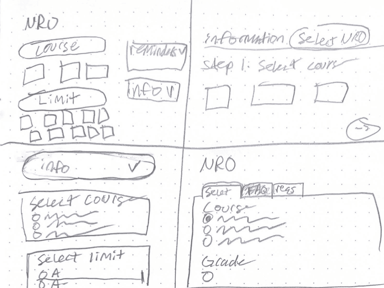
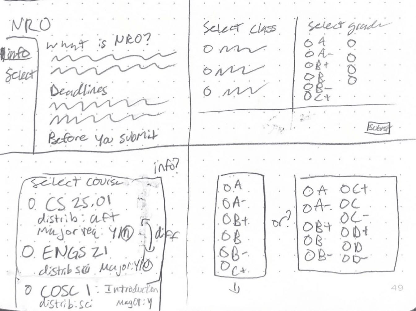
Sketching more intuitive versions of the NRO page
HMW #1
Lessen cognitive load when navigating through DartHub?
I used Crazy 8s to address this question for the NRO page. I liked designs that chunked information since that would help lessen cognitive load and make pages easier to understand.
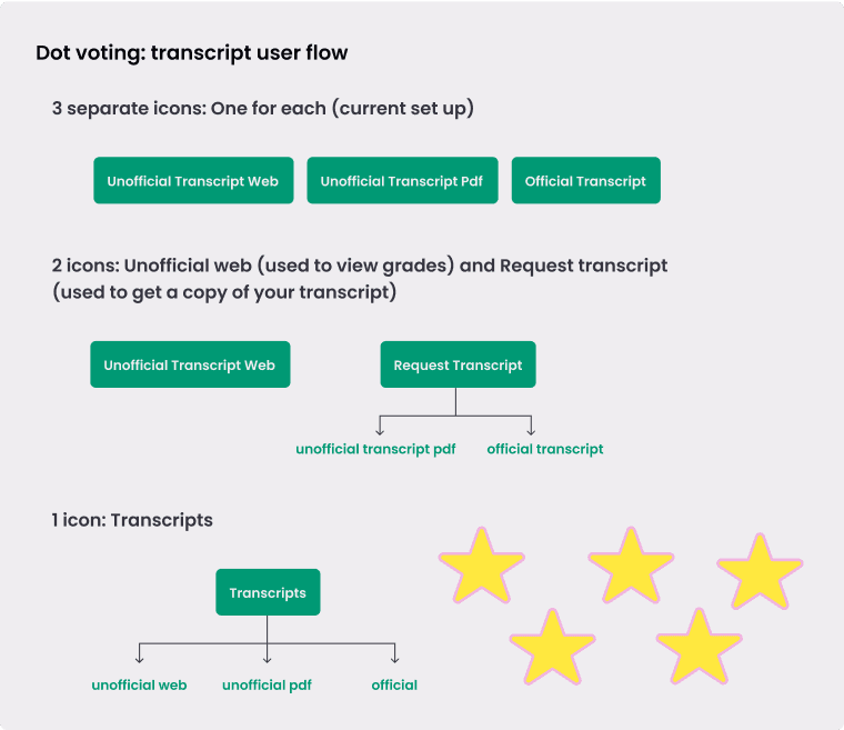
Testing user flows for the transcript grouping
HMW #2
Cater to when and how students use DartHub?
How should we group transcript tiles?
The 3 transcript tiles serve 2 use cases, but after getting feedback from 5 students I decided to combine them into a single tile.
Design jusification
This system follows Hick’s law; students can navigate to the transcript tile and then decide, instead of choosing between two transcripts among many tiles.
Prototype
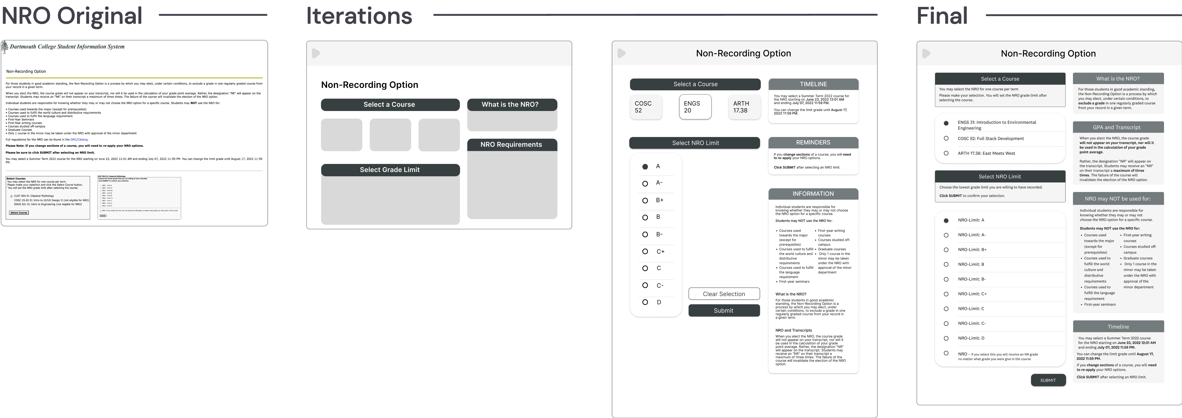
Lo-fi prototype of page layouts
As I designed grayscales, I focused on placing information into easy-to-digest chunks of information based on content.
stakeholder feedback
Initial hi-fi feedback
After creating our first hi-fi iterations, I got feedback on the new colors and layout from our clients and 3 Dartmouth students. Our partners were happy with our progress, but:
Pain point
2/3 students found the page to be too busy
Prototype
Addressing student concerns
When I went back, I looked at how to create a design language that delineates between action and information. I ultimately decided on a high contrast, dark green for action items and a low contrast green for information, while limiting the number of boxes.
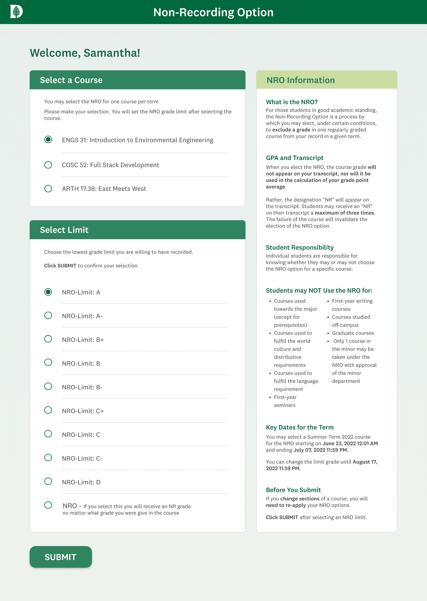
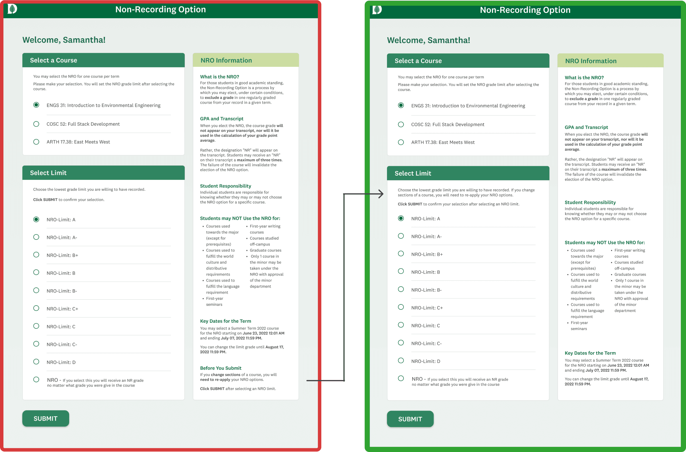
solution #1: Non-recording option
Lessening cognitive load
I reduced the number of boxes and relied font weights and color to denote sections in order to lessen the busy-ness.
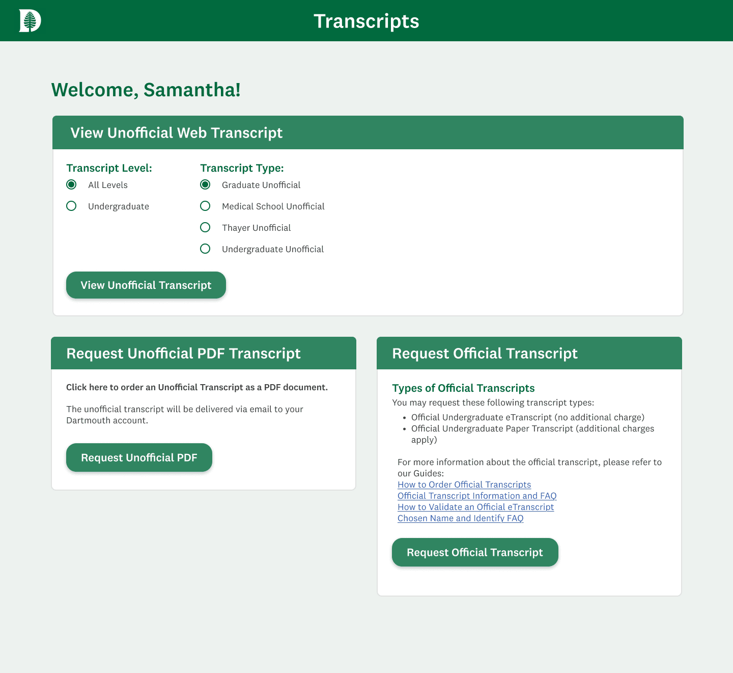
solution #2: transcript
Catering to use patterns for transcripts
The final solution consolidates all three transcript pages into one. The top section lets students view transcripts, while the bottom boxes allow them to receive a copy.
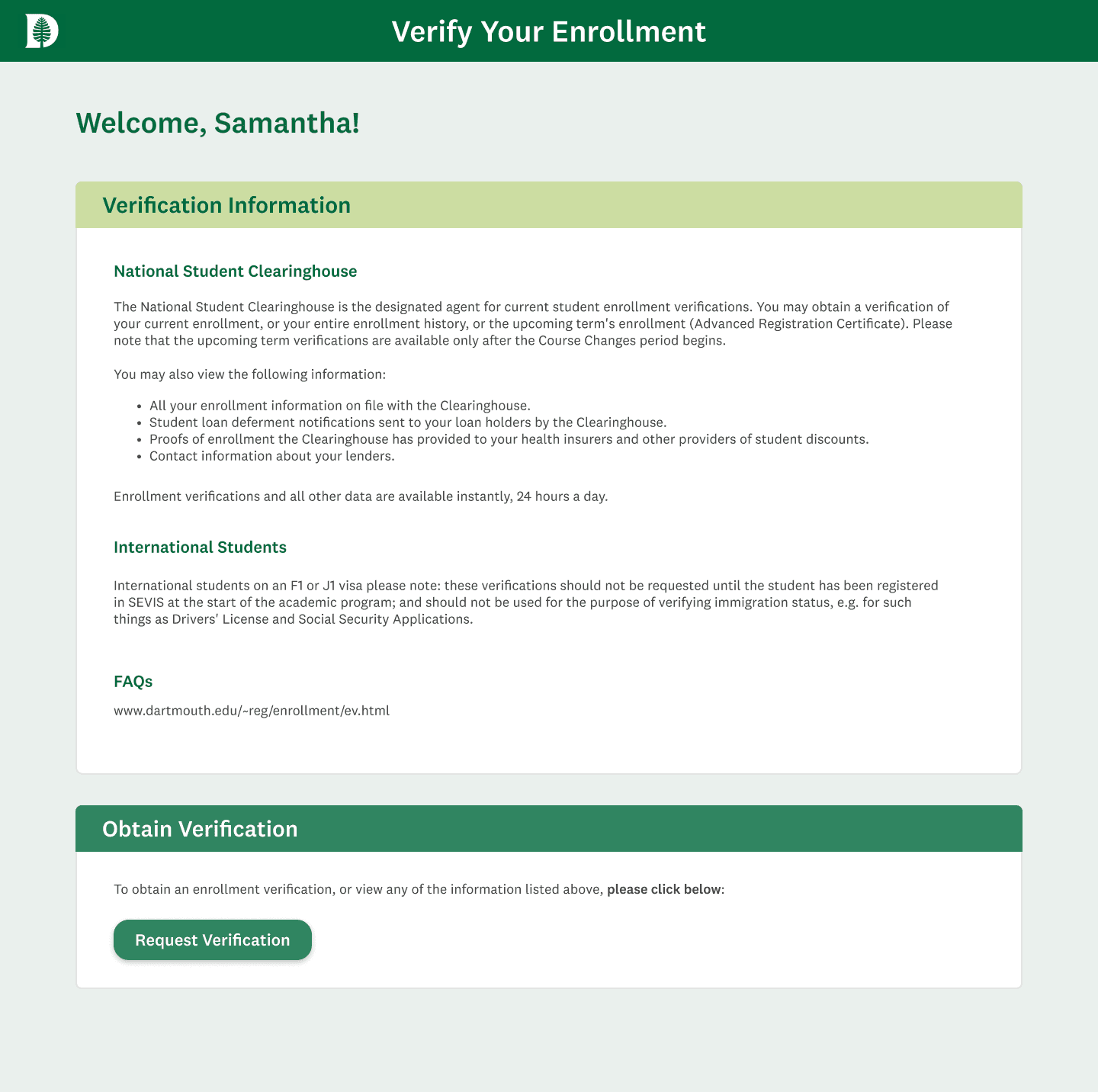
solution #3: Verify your enrollment
Understanding at a glance
The final solution focused on chunking text to make it easier to scan, highlighting what national versus international students need.
User TESTing
Key Performance Indicators
80%
User Satisfaction Rate
40
Net
Promotor Score
92%
Task Completion Rate
I conducted 5 usability tests looking at our new designs compared to the current DartHub system. KPI’s included task completion time, error rates, user satisfaction, qualitative feedback and a NPS. Overall our new design had:
Improved task completion rates
Old Version


New Version
Transcript
Improved task completion time
Students located the correct transcript tile 23% faster with our version.
Reduced error rates
Our version had no misclicks; DartHub's had misclicks 3/15 times
Higher Non-Recording Option usability ratings
Missing important information
Two students pointed out nearly missing the 'before you submit' text. I moved it to the grade limit selection box.
100% User satisfaction
Students found the new version easier to scan, more visually appealing, and felt more confident making decisions.
Confusing wording
3 students were still confused about the text in the Verify Your Enrollment page. We flagged this to our partners as we did not have permission to change the written text.
Shipped product & impact
Because of staff role changes, Dartmouth’s IT has been slow to implement changes from DALI.
Since shipping the project, Dartmouth IT has followed our suggestions of changing the schedule tiles first, as it was a prominent area of confusion in our research. More changes will be rolled out gradually.
REFLECTIONS AND NEXT STEPS
Reflections
This is one of my all-time favorite projects I’ve worked on!! What I enjoyed most was:
Using a new research method
I loved devising and running the card sorting interviews! It was so exciting to see how students approached the prompt and how similar some of their critiques were, despite giving them so much freedom. This really made my love of UX research grow!
Honing in on my craft
Not working with developers this term really allowed me to make sure I was using my design tools correctly. I became a stickler for margins, rulers, spacing, and auto layout, and thought critically about design principles and justifications.
Soft-launching design mentorship
This was my partner’s first term in DALI and she was still learning Figma basics. This encouraged me to step up and make sure I was using Figma tools properly to help teach her and set a good example!
Next steps for DartHub could include...
Addressing the original scope
Our partners wanted us to pivot to focus on page designs, but the icons of the tiles still need to be redone for clarity, as many tiles overlap in icons
Invest in UX writing
Some pages could greatly benefit from having a UX Writer make the functions of certain features and pages more clear to students
More testing and research
As new pages are incorporated to the design system, they should be continuously tested to see if there are use cases where aspects of the system don't hold up and might need to change.

